Chapter 2 examines income inequality from a regional perspective. It shows that the regions where most people live, South & Southeast Asia and Sub-Saharan Africa, remain far behind the richest ones, such as North America & Oceania and Europe. Within regions, income inequality is also large: in nearly all of them, the top 1% alone earn more than the bottom 50% combined. The chapter also highlights the role of redistribution, demonstrating that taxes and, especially, transfers can narrow these divides, although with varying effectiveness across regions.
Global and regional shifts in income and population since 1800
Over the past two centuries, the geography of income and population has undergone a significant transformation: while Europe and North America & Oceania remain the highest-income regions, East Asia, South & Southeast Asia, and Sub-Saharan Africa account for the majority of the world’s population, creating a profound imbalance between demographic weight and economic power.
Figure 2.1 presents a long-run view of yearly per capita income and population across world regions since 1800, drawing on the World Inequality Database (wid.world). On the left-hand side, the income panel displays an evident pattern of divergence, followed by partial convergence in recent years. For more than two centuries, North America & Oceania and Europe have stood out as the regions where people consistently earn the highest average incomes, well above the global level. North America & Oceania, in particular, has led since the early 19th century, with average earnings above €45,000 by 2025. Although the region’s long-term growth rate is relatively strong (1.6% per year since 1800), its pace has slowed in the 21st century (1.1% per year). Europe and Latin America have also slowed to near-stagnation since 2000.
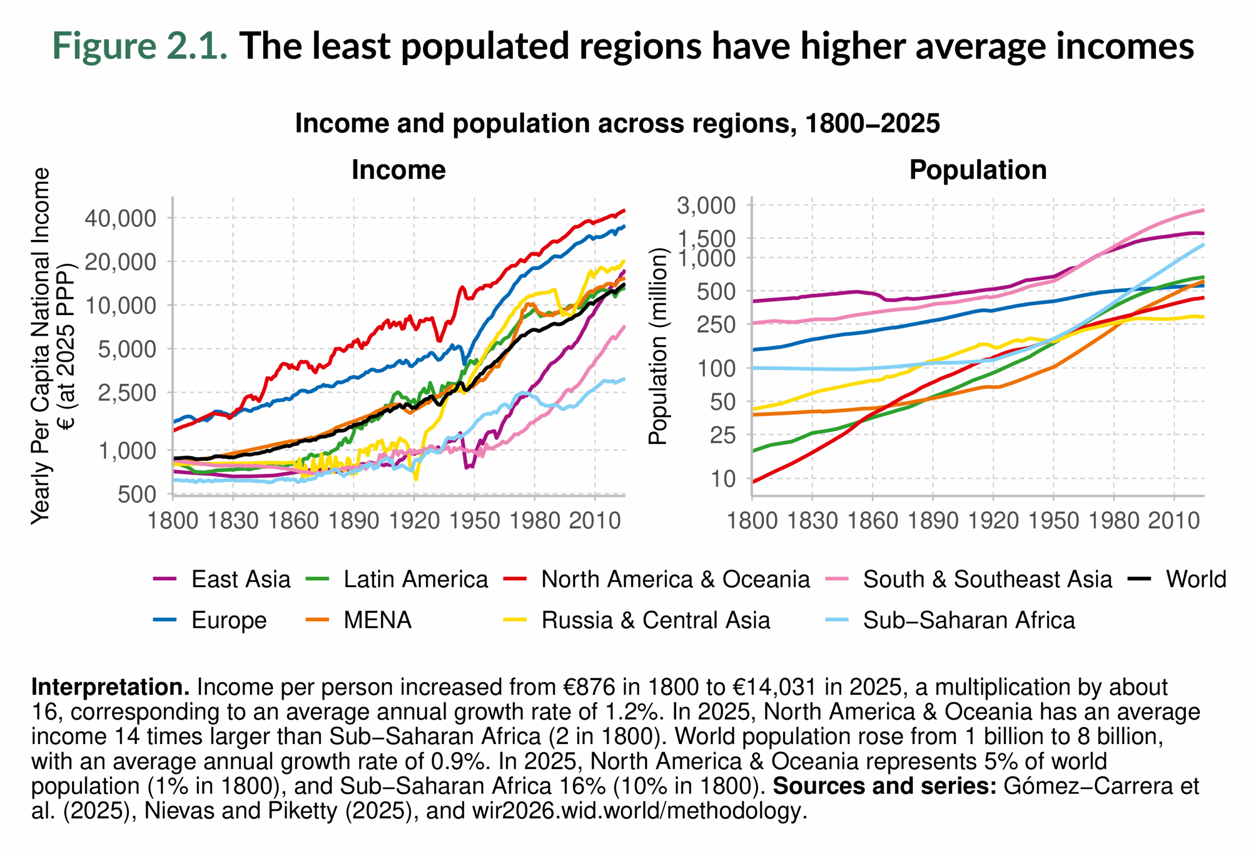

At the other extreme, Sub-Saharan Africa has experienced persistent challenges. It remains the region where people earn the least, with average income still below €3,500 in 2025. Its performance has been volatile, with declines between 1980 and 2000 and only modest improvements since then. Although its recent growth rate of 1.8% per year since 2000 marks its most successful period of progress, the gap with the rest of the world remains substantial. The Middle East & North Africa has also seen uneven growth, with modest improvements in the early 21st century after a period of stagnation.
In contrast, East Asia tells one of the most remarkable income catch-up stories of modern history. From being the poorest region in the mid-20th century, it grew at 4.2% per year between 1950 and 2025, and at an even faster 5.0% per year since 2000. The result is a dramatic transformation: East Asia’s yearly per capita income, which was below €1,000 in 1950, now exceeds €17,000, surpassing most regions. South & Southeast Asia has also accelerated, especially since 1980, making it the second-fastest-growing region in the 21st century, behind East Asia. Russia & Central Asia, which experienced episodes of income decline in the late 20th century, completes the trio of fastest-growing regions during this century.
At the other extreme, Sub-Saharan Africa has experienced persistent challenges. It remains the region where people earn the least, with average income still below €3,500 in 2025. Its performance has been volatile, with declines between 1980 and 2000 and only modest improvements since then. Although its recent growth rate of 1.8% per year since 2000 marks its most successful period of progress, the gap with the rest of the world remains substantial. The Middle East & North Africa has also seen uneven growth, with modest improvements in the early 21st century after a period of stagnation.
Globally, the most dynamic period of income growth occurred between 1950 and 1980 (2.9% per year), fueled by postwar reconstruction in Europe, the boom in North America, and the first wave of acceleration in Asia. A second wave has taken shape since 2000 (2.2% per year), led this time by Asia, while other regions slowed. This contrasts sharply with the 19th century, when global income growth was minimal, at well under 1% per year, from 1800 until 1950.
The right-hand panel of Figure 2.1 complements this picture by tracing population dynamics. Asia has been the world’s demographic center, but its internal balance has shifted. East Asia, once home to 40% of the world’s people, now represents only 20%, as population growth slowed after the 1970s (see also Figure 2.2). South & Southeast Asia, by contrast, has become the most populous region, with one-third of humanity in 2025.
Sub-Saharan Africa is notable for its rapid demographic expansion: from 10% of the world’s population in 1800 to 16% in 2025, with further increases expected.
Other regions follow different trajectories. Europe, once home to almost one-fifth of the world’s people in 1900, now represents only 7%. North America & Oceania grew in relative terms but still account for just 5%. Latin America and the Middle East & North Africa, although larger than in 1800, remain medium-sized regions, accounting for about 7–8%. Russia & Central Asia remains stable at around 4% after two centuries.
Taken together, the two panels reveal a fundamental imbalance in the global economy: the regions where people earn the most (North America & Oceania and Europe) account for only a small share of the world’s population, while the most populous regions (South & Southeast Asia and Sub-Saharan Africa) have the lowest average incomes. This combination of demographic and economic asymmetries is central to understanding global inequality, and mirrors the findings from Chapter 1, where rising averages often conceal deep divides within and between regions.
Figure 2.2 helps place these results in a broader perspective by showing how the global distribution of income and population has shifted over time. The left-hand panel illustrates regional income shares, while the right-hand panel tracks population shares. At the beginning of the 19th century, East Asia accounted for approximately 32% of the world’s income, making it the world’s economic center. Over the following century and a half, its share collapsed to only 8% by 1950, before rebounding to 25% today. Europe, by contrast, expanded its share from 26% in 1800 to nearly 40% by 1900, before declining steadily to 17% in 2025. North America & Oceania started from just 1% in 1800, surged to almost 30% by the mid-20th century, and now also stands at 17%. South & Southeast Asia, once responsible for nearly one-quarter of global income, fell to just 8% around 1950 but has since climbed back to 17%. Sub-Saharan Africa’s share has remained low, shrinking from 7% in 1800 to only 4% today, similar to Russia & Central Asia. In contrast, Latin America and the Middle East & North Africa contribute around 7–8% each.
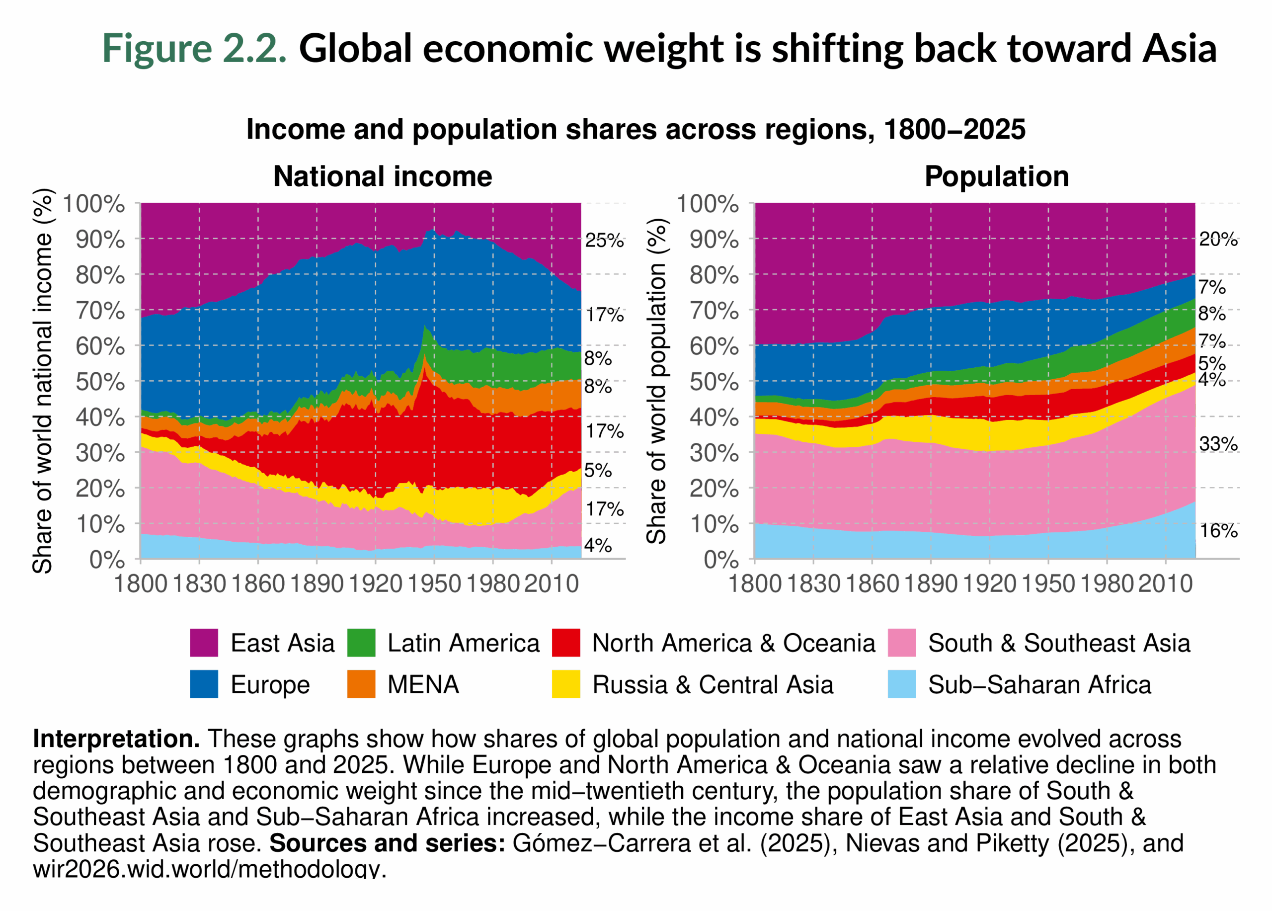
These shifts demonstrate how global economic weight has shifted over time, first toward Europe and North America & Oceania during the 19th and early 20th centuries, and more recently back toward Asia. Yet they also highlight a persistent imbalance: two of the three most populous regions, South & Southeast Asia and Sub-Saharan Africa, still capture only a limited share of total income.
Income inequality across the world in 2025
In this next section, we examine income differences across regions in 2025. Figure 2.3 presents average monthly per capita national incomes by region, adjusted for purchasing power parity to ensure comparability. The disparities are immediate and dramatic. North America & Oceania stands out with average monthly incomes of about €3,800, about 3.2 times the world average. Europe follows at €2,900 per month, about 2.4 times the global mean. Russia & Central Asia (€1,700), East Asia (€1,500), and the Middle East & North Africa (€1,300) sit closer to the middle of the global distribution, though still above average. Latin America (€1,100) falls just below the global mean, while South & Southeast Asia (€600) lags significantly behind. Sub-Saharan Africa is at the very bottom, with an average of just €300 per month.

The ratios underscore the depth of these inequalities. On average, a person in North America & Oceania earns about thirteen times more than someone in Sub-Saharan Africa, and about 2.5 times more than someone in East Asia. Even within the higher-income group, North America & Oceania earns about 1.3 times more than Europe. By contrast, South & Southeast Asia earns only half the world’s average, and about 40% of East Asia’s level. Sub-Saharan Africa falls furthest behind: its income per person is about one-fifth of East Asia’s, one-tenth of Europe’s, and one-fourth of the world’s mean.
These comparisons show a world divided into clear tiers: a high-income group (North America & Oceania and Europe), a middle group (East Asia, Russia & Central Asia, and Middle East & North Africa), and regions below or far below the world average (Latin America, South & Southeast Asia, and Sub-Saharan Africa). This reinforces the broader lesson from Figure 2.1 and Figure 2.2: the regions where most people live remain far below the income levels of the world’s richest regions, cementing the demographic and economic imbalances at the heart of global inequality.
Figure 2.4 takes the analysis to the country level. Here, the lightest shades correspond to the highest per capita monthly incomes, while the darkest indicate the lowest. The global pattern is striking. The lowest incomes are concentrated in Sub-Saharan Africa, as seen in Figure 2.3, while the highest incomes are clustered in North America, Oceania, and certain parts of Europe. Within Europe, clear differences remain: northern and western countries are among the global leaders, while several in the east fall into lower-income brackets, closer to the levels of Russia & Central Asia. East Asia now occupies a middle position in the world distribution, representing a significant improvement compared to its position in the mid-20th century (see Figure 2.1). Meanwhile, the Middle East exhibits a sharp divide between oil-rich states in the Gulf, which achieve very high-income levels, and much poorer countries, such as Yemen.

The extremes highlight the scale of the global gap. In Luxembourg, monthly income per person is about €12,110, while in Burundi it is barely €50, more than a 240-fold difference. The accompanying Boxes at the end of this chapter expand on these findings: Box 2.1 ranks countries according to per capita income, and Box 2.2 shows how country size itself relates to per capita income.
Income inequality within regions in 2025
So far in this chapter, we have analyzed inequality across regions, comparing incomes between different parts of the world, both over the long run and in 2025. Another important dimension is how populations are distributed within those regions. Figure 2.5 provides this perspective by showing the global income distribution in 2025. Each colored area corresponds to a region, scaled by its share of the world population, with the world average indicated as a reference point.
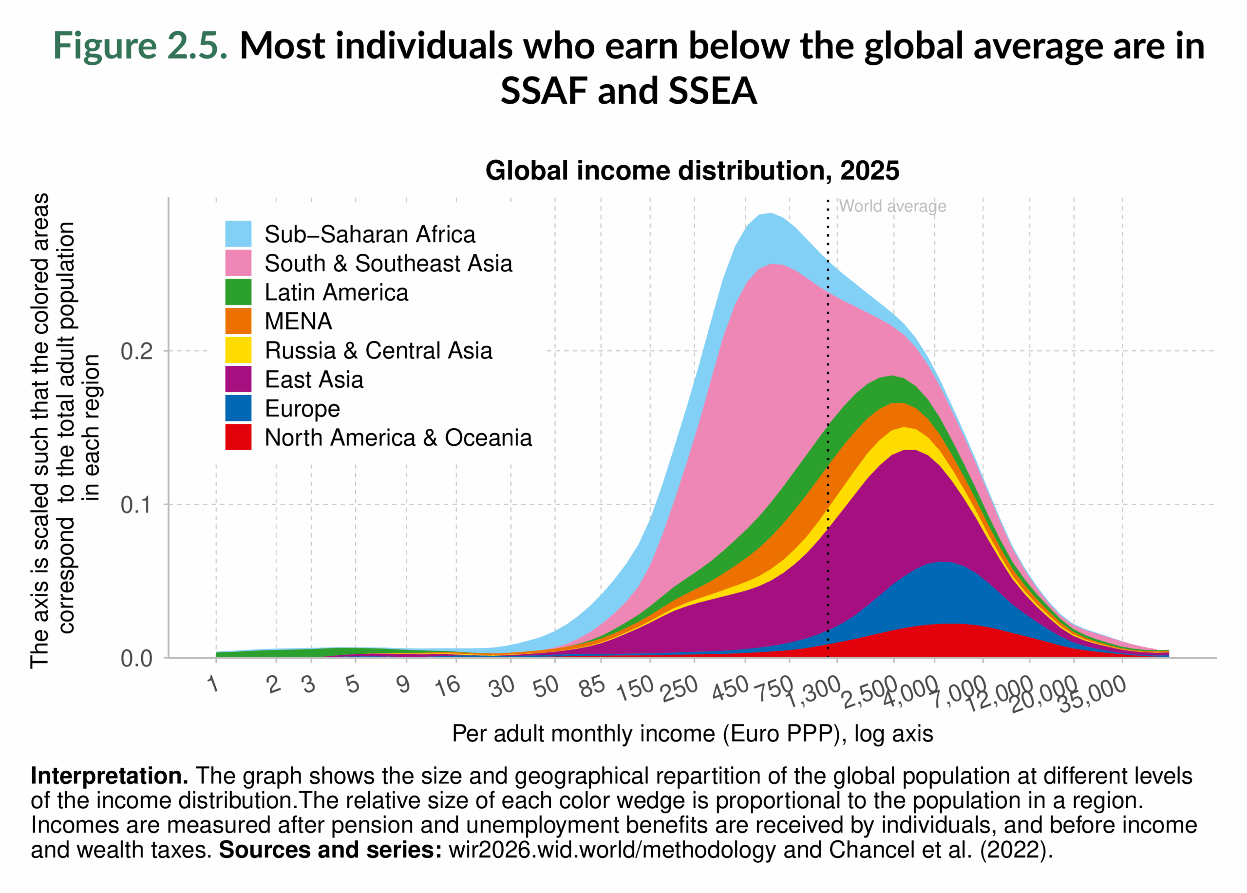
The figure reveals the sharp contrasts that define today’s global economy. Sub-Saharan Africa and South & Southeast Asia stand out as the regions where the majority of people live below the global average income of around €1,300 per month. In Sub-Saharan Africa, in particular, a large share of the population is clustered at the very bottom, earning less than €500 per month, confirming the persistent disadvantage highlighted in Figure 2.3 and Figure 2.4. South & Southeast Asia spans a broader range, but still remains concentrated below global averages.
By contrast, Europe and North America & Oceania appear almost entirely to the right of the world average, with most of their populations earning several times more than the global mean. Russia & Central Asia also sit above the world average for the majority of their populations. Latin America and the Middle East & North Africa show a more mixed pattern: their populations are split between lower and higher income levels, reflecting both pockets of relative prosperity and areas of stagnation. East Asia illustrates one of the most significant transformations. Once concentrated at the very bottom of the world distribution (see also Figure 2.1 and Figure 2.7), the region now has a large share of its population above the global average. This shift highlights East Asia’s rapid upward mobility and its increasing influence in shaping the global middle class.
Figure 2.6 revisits the standard breakdown of the population into the bottom 50%, the middle 40%, and the top 10% (see Figure 8), with the latter now divided between the top 1% and the next 9%. Regions are ordered by the share of income earned by the top 1%, which immediately reveals how unevenly income is distributed globally. Europe demonstrates the least unequal distribution: the bottom 50% earn 19% of total income, the highest share worldwide, while the middle 40% capture 45%. Together, this means that nearly two-thirds of all income in Europe goes to the bottom 90% of the population, a pattern unmatched elsewhere. Yet inequality is still visible: the top 10% earn 36%, and the top 1% alone captures 12%.
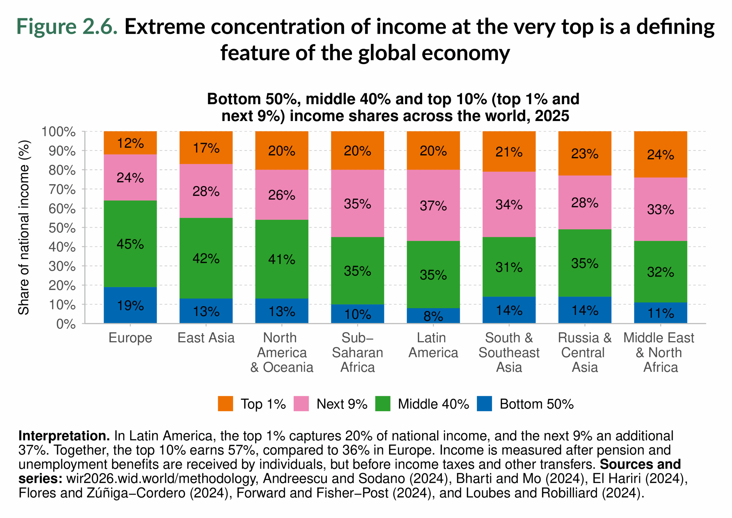
East Asia and North America & Oceania present similar profiles in some respects: in both, the middle 40% earn just above 40% of total income (42% and 41% respectively), and the top 10% capture about 46%. In both cases, the bottom 50% earn only 13%, significantly below Europe. However, there are also notable differences between the two regions. In North America & Oceania, the top 1% alone takes 20% of all income, a larger concentration than in East Asia, where the top 1% capture 17%. This means East Asia’s middle class is slightly stronger relative to the top, even though both regions show a weaker bottom half compared to Europe.
Russia & Central Asia is marked by an even sharper concentration at the very top: its top 1% earn 23% of total income (similar to the Middle East & North Africa), far more than the bottom 50% (14%). This inversion, where the top 1% earn more than the entire bottom half, is present in every region except Europe. Put differently, in almost all regions, just 1% of the population receives more income than half of the region’s population combined.
The imbalance is most extreme in Latin America, Sub-Saharan Africa, and the Middle East & North Africa. Here, the bottom 50% earn just 8–11% of income, while the top 10% capture between 55% and 57%. Within that, the top 1% alone secures 20–24% of total income, more than double the share of the bottom half. These regions combine both a very weak bottom 50% and a disproportionately large top 1%, making them the most unequal. South & Southeast Asia shows a similar profile but with a somewhat stronger bottom 50% (14%), though its top 1% still captures 21% of total income. These results show that extreme concentration of income at the very top is a defining feature of the global economy today.
Figure 2.7 provides a geographic breakdown of global income groups in 1980 and 2025, highlighting how the composition of top earners and other groups has shifted over time. In 1980, the global elite was overwhelmingly concentrated in North America & Oceania and Europe, which together accounted for most of the world’s top income groups. Latin America also had some presence near the top, but China and India were almost entirely confined to the bottom half of the distribution. At that time, China had virtually no presence among the global elite, while India, Asia in general, and Sub-Saharan Africa were heavily concentrated in the very lowest percentiles.
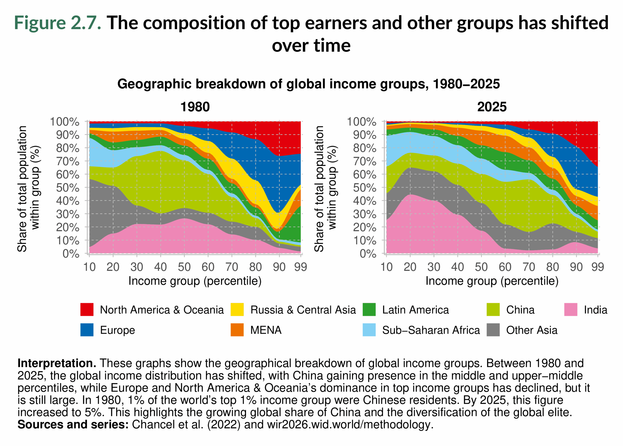
By 2025, the picture looks markedly different. China’s position has shifted upward: much of its population has moved into the middle 40%, and a growing share has entered the upper-middle segments of the global distribution. This is also true for other Asian countries. India, by contrast, has lost relative ground: in 1980, a larger part of its population was in the middle 40%, but today almost all are in the bottom 50%. Sub-Saharan Africa has also remained in the lower half of the global distribution, though its population is now more evenly spread within the bottom 60% rather than clustered almost entirely below the 30th percentile, as it was in 1980.
At the upper end of the distribution, continuity is unmistakable. North America & Oceania continue to dominate the global top 1%, with Europe also maintaining a large share. The composition of the global elite has diversified somewhat, with the Middle East & North Africa and Russia & Central Asia gaining ground, while Latin America’s representation has declined compared to 1980.
The shifts in Figure 2.7 reveal a partial reshaping of the global income hierarchy. The rise of China has expanded the global middle class, while the very top remains concentrated in the Global North, and the bottom is heavily populated by South Asia and Sub-Saharan Africa. In short, the geography of inequality has been reshuffled, but not overturned.
Income inequality within countries in 2025
Figure 2.8 to Figure 2.12 take us inside national income distributions, showing how income is divided between the bottom 50%, the middle 40%, and the top 10% (with a focus also on the top 1%). Together, they illustrate how inequality plays out not only between regions but also within individual countries, and how the balance between these groups varies across the world.
Figure 2.8 begins with the bottom 50%. The poorest half of the population captures only a small share of national income almost everywhere. In the most unequal countries of Latin America and Sub-Saharan Africa, their share falls as low as 6–12%, while in the least unequal economies (mainly in Europe) it rises to 19–29%. North America & Oceania occupy an intermediate position: Canada and Australia are closer to Europe, while the United States is closer to the patterns of inequality of the Global South, with the bottom half receiving around 12–14%. Across Asia, outcomes are diverse. South Asia and much of Southeast Asia fall below 16%, while East Asia is in the mid-range (14–19%), though China lags behind several of its neighbors. Strikingly, nowhere in the world does the bottom half secure more than 30% of income, underscoring their structural exclusion from national income.

Figure 2.9 turns to the middle 40%, often considered the backbone of the middle class. Here the contrasts are equally stark. In the most unequal settings, especially in Latin America and parts of Africa, the middle 40% receive as little as 23–25% of income, reflecting a fragile middle class. By contrast, in Europe and parts of North America & Oceania, this group’s share rises to 44–50%, making them central to national income distribution. Asia shows both ends of the spectrum: India’s middle 40% remains in the lower levels, while China’s earns a larger share.

Figure 2.10 highlights the top 10%. Nowhere does this group earn less than 26% of income. Even in the least unequal countries, the richest 10% still receives more than a quarter of all income. In many countries, especially in Latin America, Sub-Saharan Africa, and the Middle East & North Africa, their share rises above 50%, reaching up to 71% in the most unequal cases. North America & Oceania again split: Canada and Australia sit closer to European patterns, while the United States is more unequal, with the top 10% capturing nearly half of all income.

Figure 2.11 zooms in further on the top 1%. This group, though tiny, captures remarkably large shares. In the least unequal settings, the share of this group remains around 7–11%, while in the most unequal countries, it increases to about 21–44%. Latin America and the Middle East & North Africa are again at the upper end, with the United States also appearing among the most unequal. By contrast, Canada, Australia, New Zealand, and most of Europe record lower top 1% shares, though still substantial by any measure. The comparison highlights how some countries have seen the rise of economic elites whose income rivals, or even exceeds, that of the entire bottom half.

Finally, Figure 2.12 illustrates the ratio of the incomes of the top 10% to those of the bottom 50%. This single measure captures the scale of inequality in a way that is easy to grasp and compare (see also Figure 1.13). In Europe, the ratio is relatively low, around 9–19: the top 10% earn nine to nineteen times more than the bottom 50%. In Canada, Australia, and New Zealand, the ratio is relatively low; however, in the United States, it is higher and closer to the levels found in the Global South. In Latin America and southern Africa, the ratio exceeds 40:1, and in some cases surpasses 100:1, meaning the top 10% earn more than a hundred times the income of the bottom half. Much of South Asia and the Middle East & North Africa also register high ratios, while East Asia is closer to the middle range.

These figures collectively present a consistent picture: income inequality within countries is severe globally, but its intensity varies systematically. Europe, and parts of North America & Oceania, are among the least unequal regions by global standards, although even there, there is large concentration at the top groups. The United States is a notable example of high inequality compared to its high-income peers. Latin America, southern Africa, and the Middle East & North Africa are at the other extreme, with both weak bottom and middle groups and extreme concentration at the top. Asia illustrates the diversity of possible trajectories, with East Asia performing better overall. Across all countries, the maps confirm a fundamental point: the poorest half is consistently underrepresented, the middle class is fragile in much of the world, and the top, especially the top 1%, continues to command disproportionate power over income. The World Inequality Database is particularly useful in this context, as it provides consistent and comparable measures of inequality across countries.
The role of redistribution in reducing income inequality
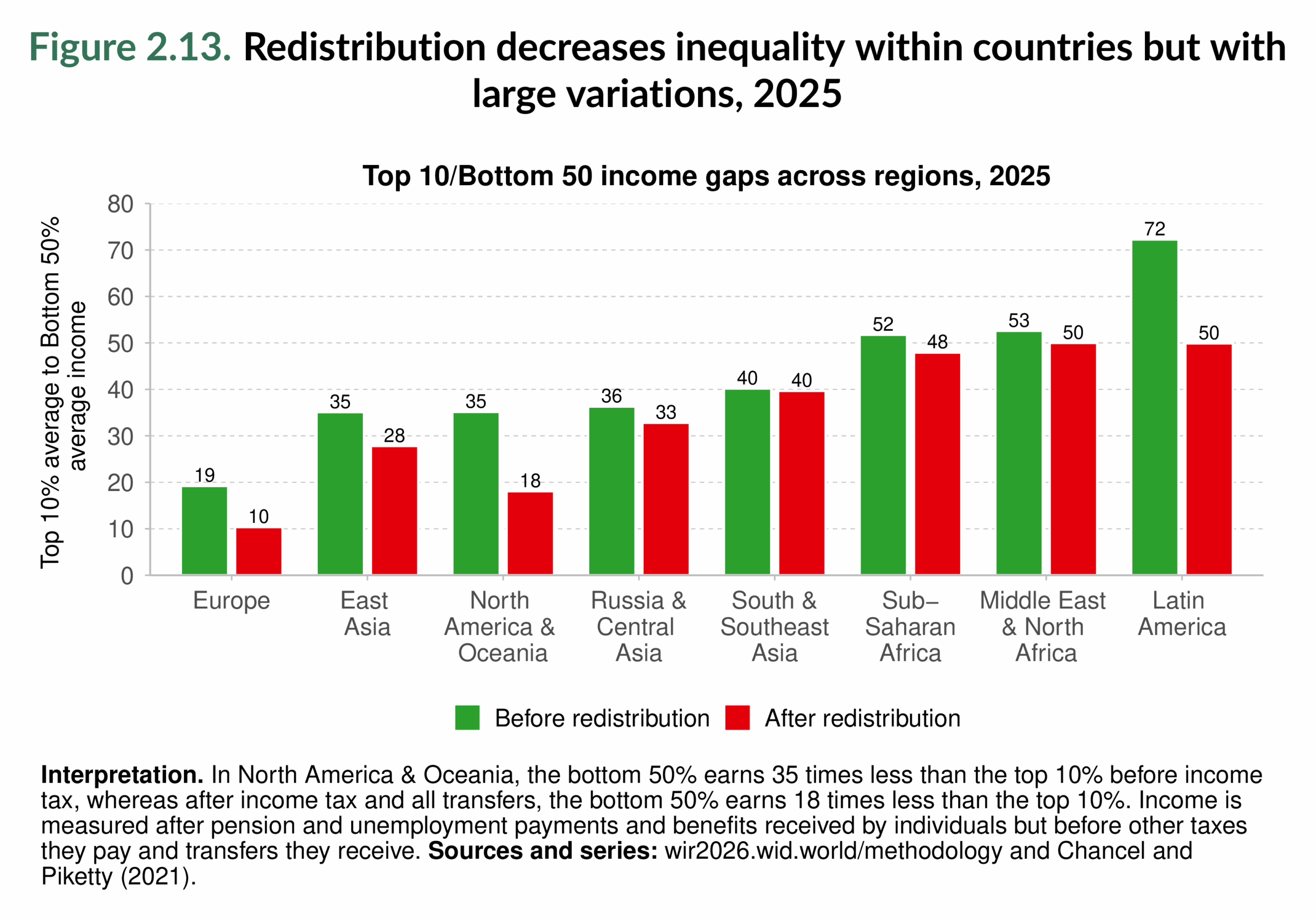
The previous maps showed how unequal income distributions are across countries before government intervention. This section turns to a key question: how much do governments reduce inequality through redistribution? Redistribution here refers to the combined effect of taxes and transfers, such as social benefits, pensions, and other government programs, on the distribution of income. Figure 2.13 provides the first overview by comparing, at the regional level, inequality before and after redistribution, measured by the ratio of the average income of the top 10% to that of the bottom 50%. The results show that redistribution reduces inequality everywhere, but the extent of its impact varies widely across regions. Europe stands out as the most effective case: before redistribution, the richest 10% earn about nineteen times more than the bottom 50%, but afterwards this ratio falls to ten times, the lowest level worldwide. North America & Oceania also achieve a sharp reduction, with the ratio falling from thirty-five to eighteen. Latin America records the highest pre-redistribution gap in the world at 72:1, yet taxes and particularly transfers bring this down to 50:1. This is a substantial improvement, but still leaves the region among the most unequal, alongside Sub-Saharan Africa and the Middle East & North Africa. By contrast, redistribution has only a limited effect in Sub-Saharan Africa, the Middle East & North Africa, South & Southeast Asia, and Russia & Central Asia, where ratios fall by four points or less.
The reason for these differences becomes clearer in Figure 2.14, which separates the effects of taxes and transfers over time. The left panel isolates the effect of taxes alone. With few exceptions, the impact of taxation on inequality is minimal. In Latin America, and in Russia & Central Asia since the 2000s, tax systems are not only weakly redistributive but sometimes regressive, meaning they increase the income gap between rich and poor. In most regions, the redistributive power of taxes is low. Even in the region with the most persistently progressive tax system, North America & Oceania, the effect of taxation alone is modest. Figure 2.14 also shows that tax progressivity has stagnated in most regions since 1980, and that there has been no cross-country convergence in effective tax rates (see Fisher-Post and Gethin (2025))1.

Figure 2.15 complements the left-hand panel of Figure 2.14. It maps tax progressivity at the country level. In many countries, particularly in Latin America, Eastern Europe, and parts of Africa, taxes amplify rather than reduce inequality. At the other end of the spectrum, a smaller group of countries, mostly in North America & Oceania and Western Europe, manages to reduce inequality through progressive tax design, cutting gaps between top and bottom groups by 5%–20%.

The right panel of Figure 2.14, which adds transfers, tells a very different story. With pensions, social benefits, and other transfers included, redistribution becomes persistently much more powerful. Europe achieves the largest reductions, cutting inequality by over 40%. North America & Oceania also record large reductions once transfers are taken into account, though slightly less than in Europe. Latin America, despite its regressive tax systems, achieves substantial reductions through transfers alone, underscoring their central role in contexts of high inequality. East Asia has also strengthened redistribution since the 2000s, reaching levels comparable to those of the Middle East & North Africa. By contrast, South & Southeast Asia, Sub-Saharan Africa, and Russia & Central Asia remain at the bottom, where both taxes and transfers, though positive, have limited reach.
Figure 2.16 reinforces this conclusion with a global map of redistribution accounting for both taxes and transfers. Transfers consistently reduce inequality across all regions, but their strength varies greatly. The largest impacts appear in Western Europe and in North America & Oceania, where redistribution cuts inequality by 40%–60% and, in some cases, even more. South Africa is also notable for the magnitude of redistribution through transfers. Latin America shows significant reductions as well, but nearly all of the effect comes from transfers, while weak or regressive taxes undermine progress. In much of Asia and Africa, redistribution remains modest, with a handful of countries, such as Japan, Thailand, and Taiwan, achieving larger gains than their neighbors2.

Tax-and-transfer systems reduce inequality everywhere, but the effectiveness of redistribution depends heavily on fiscal design. Taxes alone often do little to close income gaps, and in many countries they make them worse. Transfers, by contrast, provide a consistent and powerful equalizing force. According to research by Fisher-Post and Gethin (2025), transfers account for more than 90% of the reduction in inequality, while taxes contribute less than 10%.
Main takeaways
Income inequality between regions remains a defining feature of the global economy. Regional comparisons reveal that contemporary inequalities stretch back nearly two centuries. Over the past decades, East Asia and South & Southeast Asia have experienced rapid gains in per capita income, yet large gaps remain. Today, the regions with the highest incomes, North America & Oceania and Europe, account for only a small share of the world’s population, while two of the most populous regions, South & Southeast Asia and Sub-Saharan Africa, continue to record the lowest average incomes. The scale of inequality between regions is remarkable: average incomes in North America & Oceania and Europe are several times higher than the global mean, while those in Sub-Saharan Africa and South & Southeast Asia remain far below average, with incomes only a fraction of the level of the Global North. To illustrate the scale of this divide, the average person in North America & Oceania earns around thirteen times more than the average person in Sub-Saharan Africa.
Within regions, inequality is also stark. In all parts of the world, the bottom 50% secures only a small fraction of national income, whereas extraordinary shares are concentrated in the top 10%, and especially the top 1% of the population. In every region except Europe, the top 1% alone earn more than the entire bottom half combined. In terms of changes in income over time within each region, China demonstrates the greatest upward shift, with much of its population moving into the middle 40% of the global distribution, reflecting the rise of a new middle class, even as inequality persists.
Inequality levels within countries vary significantly. Countries in Europe and North America & Oceania are among the least unequal, though even there, top groups retain significant dominance. The United States is a clear outlier, displaying much higher inequality than its high-income peers. At the other extreme, countries in Latin America, southern Africa, and the Middle East & North Africa combine weak bottom and middle groups with extreme concentration at the top.
Redistribution through taxes and transfers plays a critical role in reducing inequality. While tax-and-transfer systems reduce inequality in every region, their effectiveness depends heavily on fiscal design. Taxes alone often have little impact, and in some countries they even exacerbate inequality, whereas transfers consistently serve as the main equalizing force, accounting for more than 90% of the reduction in inequality. Strengthening the progressivity of taxes and expanding transfer systems, therefore, remain essential to reduce income concentration at the top and exclusion at the bottom.
Looking ahead, Chapter 3 examines wealth inequality, where disparities are even larger and the concentration at the top is even more pronounced than in the case of income.
Box 2.1: Country rankings for large countries according to per capita national income
Box 2.1 ranks large countries (those with populations above 10 million) by per capita national income in 2024 and complements Figure 2.4. The ranking underscores the vast disparities in living standards across the world, even after adjusting for comparable prices (PPP). Small countries are excluded here to ensure comparability, as many resource-rich economies or financial centers (such as Luxembourg, Qatar, or Monaco) display extremely high averages that are not representative of broader global patterns. These cases are presented separately in Box 2.2.

At the top of the ranking are Taiwan, the United States, the United Arab Emirates, the Netherlands, Sweden, Belgium, Germany, Australia, Canada, and Saudi Arabia. In these economies, per capita monthly incomes range between €3,200 and €4,300. Put differently, in just a single day, the average resident of these countries earns as much as the average resident of the poorest large economies does in an entire month.
At the other end of the spectrum, the poorest large countries are Burundi, Yemen, Mozambique, Somalia, the Democratic Republic of Congo, Malawi, Madagascar, South Sudan, Niger, and Chad. In these countries, average monthly incomes fall below €130, and in Burundi, they collapse to just €50.
It is important to stress that living on €100 a month, barely €3 a day, represents a country average. Yet averages conceal even harsher realities: given the large inequalities documented throughout this chapter, a large part of the population in these countries survives on far less than the average, making daily life considerably more precarious than these figures alone suggest.
Box 2.2: Country rankings according to per capita national income
Table B2.2.1 in Box 2.2 extends the income ranking to all countries, including small and ultra-small economies. Many of these very small countries record extremely high per capita incomes, well above the world average. The top ten countries are Monaco, Liechtenstein, Luxembourg, Bermuda, Guernsey, Jersey, Singapore, the Cayman Islands, Macao, and Anguilla. Most are well-known tax havens or offshore financial centers, where concentrated wealth, financial services, or resource rents boost national income averages far beyond what is seen in larger economies. Monaco and Liechtenstein, for example, report average monthly incomes exceeding €12,000, more than 200 times higher than those recorded in the poorest countries.

Most of the ten countries in this ranking have a population below one million inhabitants. Singapore is the notable exception, combining high income levels with a population of about six million.
At the other end of the table, the poorest small countries look very similar to those listed in Box 2.1, with the addition of the Central African Republic and Liberia.
Figure B2.2.2 in Box 2.2 places these outcomes in historical perspective. It shows that ultra-small countries, with populations under 100,000, have consistently recorded per capita incomes well above the world average since 1970, and their relative advantage has widened over time. By 2024, their incomes stand at around four times the global average. By contrast, the only category with incomes persistently below the world average is the very largest countries, those with more than 500 million inhabitants, namely China and India. Yet here the trend is impressive: both countries have experienced rapid income growth over the past decades and are now converging toward the world average, a dramatic shift compared to the much lower relative levels observed in 1970.
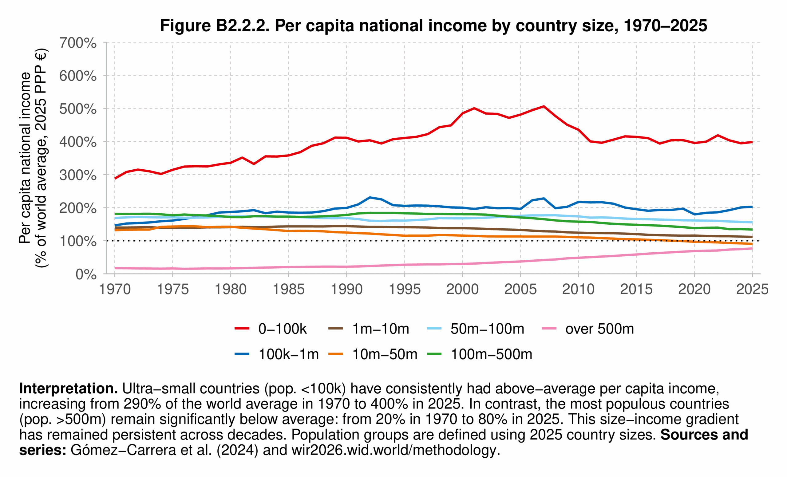
These findings highlight how small financial hubs and tax haven economies, despite their limited populations, play an outsized role in shaping global income patterns. At the same time, they underscore the structural disadvantage of the world’s most populous countries, where hundreds of millions of people live in economies that still lag behind global averages—even if, in the cases of China and India, the gap is closing at a remarkable pace.
1 Importantly, Fisher-Post and Gethin (2025) find that tax progressivity is uncorrelated with national income per capita.
2 Fisher-Post and Gethin (2025) also highlight important compositional differences in transfers. In Europe, social assistance programs are the most significant driver of redistribution, while in Africa, healthcare-related transfers play a comparatively larger role.


