This chapter examines through a regional lens who owns the world’s wealth and how that ownership has changed in recent decades. It starts by analyzing how much wealth there is at the global and regional level, and how it is split between the public and private sectors. It then goes on to assess wealth inequality within regions and within countries.
As the world has grown wealthier, who has captured the associated benefits? The data show that wealth has grown faster than income. Wealth growth is being accumulated mainly in private hands and, in all regions, is distributed far more unequally than income (seen in Chapter 2). Compared to the 1990s, East Asia has now emerged as a major holder of the world’s assets, joining Europe and North America & Oceania.
Wealth inequality trends across regions
Global wealth has expanded dramatically over the past three decades, but the gains have not been evenly shared across regions (Figure 3.1). In absolute terms, all regions recorded significant increases in net national wealth between 1995 and 2025 . Yet when viewed in relative terms, the map of global wealth has been redrawn.


The most notable transformation has occurred in East Asia. In 1995, the region accounted for roughly one-fifth of global wealth; by 2025, its share has risen to over one-third, making it the world’s largest wealth-holding region. This surge mirrors the rapid rise in incomes observed in Figure 2.1, but the scale of the shift in wealth is even greater. Over the entire 1995–2025 period, East Asia’s wealth grew by nearly 7% per year, more than double the growth rate of Europe and faster than the global average.
By contrast, Europe’s relative weight in the global distribution of wealth has declined sharply. In 1995, Europe held over one-quarter of global wealth, but by 2025, this share has fallen to 16%. The underlying reason is slower wealth accumulation: Europe’s wealth has grown at just above 3% annually since 1995, among the lowest regional rates. North America & Oceania, meanwhile, has broadly maintained its position, with annual wealth growth of about 4.3%, roughly in line with the global average (see Bauluz, Brassac, et al. (2025)).
Other regions have experienced smaller but notable changes. South & Southeast Asia recorded robust annual wealth growth of 6%, second only to East Asia, although its global share, around 13% in 2025, remains well below its significant share of
Other regions have experienced smaller but notable changes. South & Southeast Asia recorded robust annual wealth growth of 6%, second only to East Asia, although its global share, around 13% in 2025, remains well below its significant share of the world’s population (33%, see Figure 2.2). Latin America and Russia & Central Asia lagged behind, with wealth growth averaging below 3%, resulting in stagnating or declining global shares. By contrast, the Middle East & North Africa posted relatively dynamic growth (nearly 5% annually), overtaking Latin America in the mid-2010s. Sub-Saharan Africa, starting from a very low base, grew at about 4.7% annually, faster than Latin America, Russia & Central Asia, and even Europe, yet it still accounts for only around 2% of global wealth today.
The geography of global wealth growth has shifted decisively toward Asia, while Europe’s centrality has waned. The disparity between regional shares of population (seen in Figure 2.2) and wealth highlights the enduring concentration of economic power: regions with smaller populations (North America & Oceania and Europe) still hold disproportionate shares of global wealth, while populous areas such as Sub-Saharan Africa remain marginalized in the global distribution.
We now turn to Figure 3.2, which traces the historical ratio of net national wealth to net national income from the mid-19th century to today, for which data exist and estimates have been produced. This measure shows how much wealth countries hold relative to their annual income, offering a long-run view of the balance between accumulated wealth and economic activity. At the start of the 20th century, wealth levels were exceptionally high in Europe . In France and the United Kingdom , national wealth exceeded seven times annual income, with Germany somewhat lower. These peaks collapsed during World War I and fell further during World War II, leaving mid-century wealth ratios at historic lows. The wars illustrate how quickly accumulated wealth can be destroyed by large-scale shocks. Outside Europe, trajectories differed. The United States and India saw moderate increases during the interwar years, but both, like Europe, experienced declines during and after World War II.
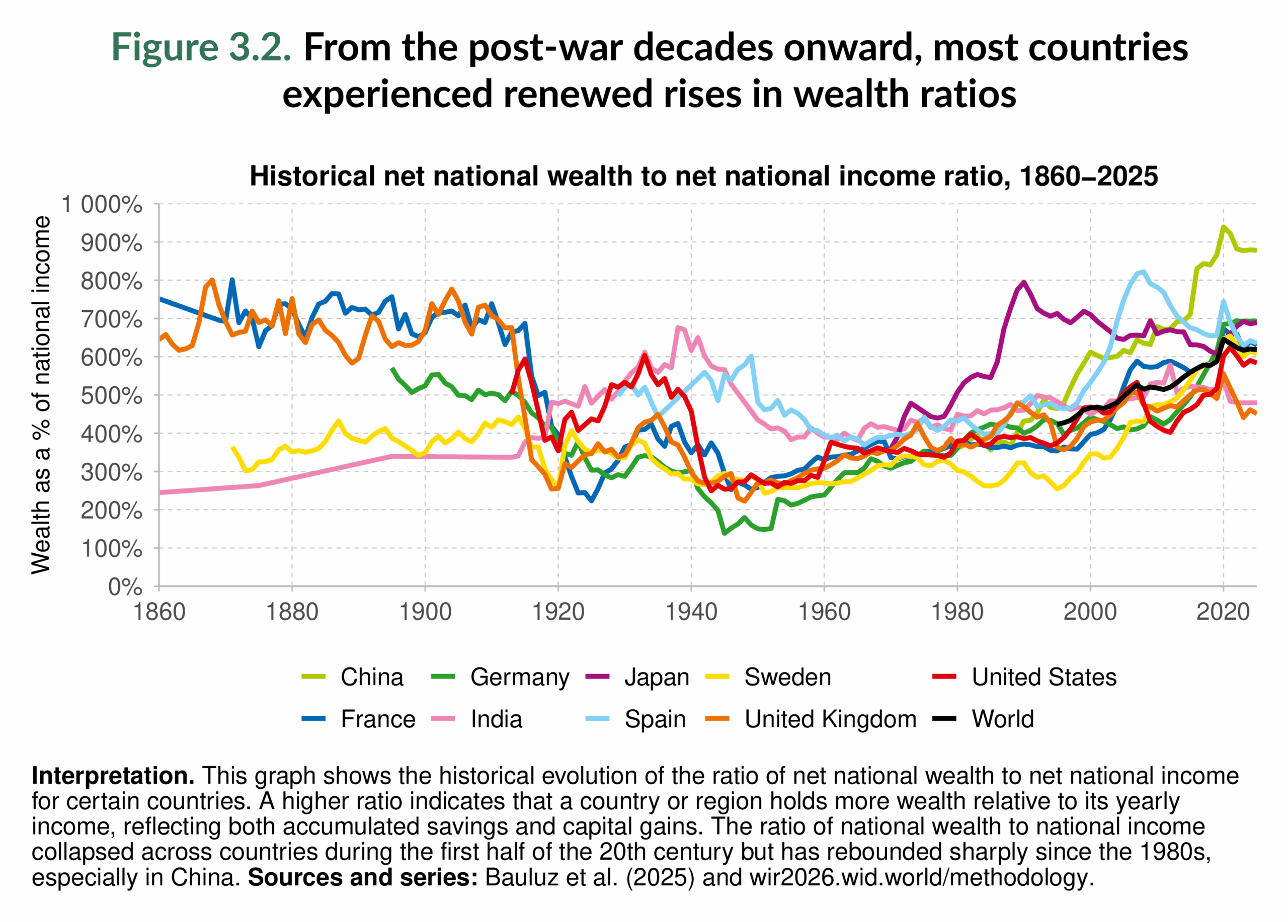
From the postwar decades onward, most countries experienced renewed rises in wealth ratios. Japan stood out for its surge in the 1970s and 1980s, fueled by rapid industrialization and asset booms, though its trajectory stalled after the 1990s real estate crisis and only began to rebound modestly in the 2020s. The most striking recent change has been in China. Since the 1990s, and accelerating through the 2000s and 2010s, its wealth-to-income ratio has soared to around 900%, roughly nine times annual income, by the early 2020s. Despite a dip during the COVID-19 pandemic, China still records the highest ratio among major economies. The long-run picture is one of collapse and recovery: wealth-to-income ratios were destroyed by the wars of the 20th century for belligerent countries, but have rebounded sharply in recent decades.
Figure 3.3 looks at how the composition of wealth has evolved across regions since 1995. Wealth as a share of national income can be broken down into two components: domestic capital, which represents the stock of assets located within a country’s borders, and net foreign assets, which reflect the balance between what residents own abroad and what foreigners own domestically.
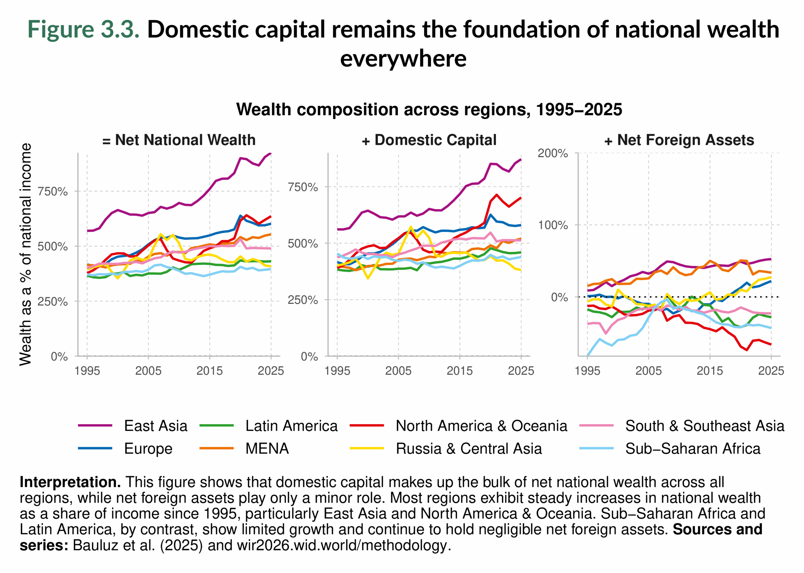
Across the globe, domestic capital accounts for the bulk of wealth, but net foreign assets highlight significant differences between regions. In North America & Oceania, for instance, wealth is largely domestically held, but foreign positions are negative, meaning that outsiders collectively own more assets within the region than residents hold abroad. East Asia presents the opposite picture: its positive foreign asset balance lifts total wealth above the value of domestic capital. This dynamic has reinforced East Asia’s rise as the world’s largest wealth-holding region, as already seen in Figure 3.1.
Other regions show more modest or contrasting patterns. The Middle East & North Africa also holds positive foreign assets, though on a smaller scale. By contrast, South & Southeast Asia, Latin America, and Sub-Saharan Africa generally record negative foreign assets balances, underscoring their reliance on external capital and the fact that part of their domestic wealth is owned by foreigners. In recent years, Europe has begun to resemble the East Asian case, with residents increasingly holding more assets abroad than foreigners own within Europe. Russia & Central Asia, meanwhile, has seen a similar movement toward a positive position.
The overall picture is twofold. First, domestic capital remains the foundation of national wealth everywhere. Second, although net foreign assets are relatively small in scale, they determine the highly embedded nature of global financial linkages. East Asia, Europe, and the Middle East & North Africa hold more assets abroad than foreigners own within their borders. By contrast, a significant portion of the wealth in North America, Latin America, and Sub-Saharan Africa is effectively owned outside their borders. Global wealth is not only concentrated but also deeply interconnected across regions.
Figure 3.4 illustrates the evolution of net foreign wealth across regions, expressed both in relation to regional GDP (left) and global GDP (right). These balances reveal which regions act as global creditors and which as debtors. In the 19th and early 20th centuries, Europe held the largest foreign asset position in history, with net wealth abroad reaching over 70% of its GDP and close to one-third of world GDP before 1914. Much of this was built on colonial extraction and unequal exchange, as is mirrored by the heavily negative positions of South & Southeast Asia and Sub-Saharan Africa (see Nievas and Piketty 2025).
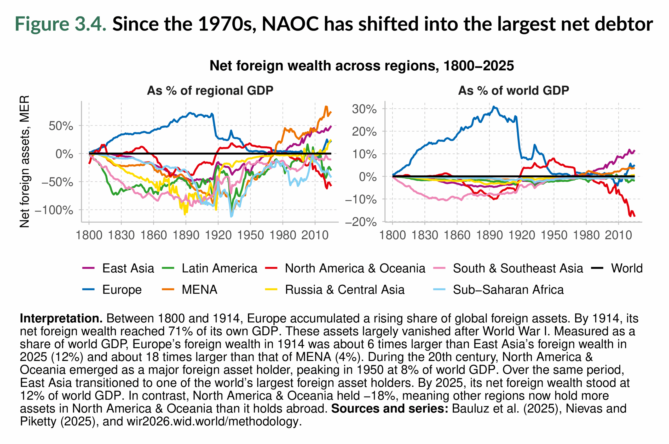
The two world wars, revolutions, and decolonization brought this dominance to an abrupt end, wiping out most of Europe’s external holdings.
The mid-20th century saw North America & Oceania briefly become the world’s leading creditors, peaking at around 8% of world GDP in the 1950s. But since the 1970s, the region has shifted into the largest net debtor, with balances now at 18% of world GDP.
The most dramatic contemporary transformation has been in East Asia. Since the 1970s, the region has become the largest creditor. Today, it holds about 12% of the world’s GDP. The Middle East & North Africa has also maintained a strong positive balance since the oil boom of the 1970s, while Europe has rebuilt modest surpluses in recent decades. By contrast, Latin America, Sub-Saharan Africa, and South & Southeast Asia remain consistent debtors, with foreigners owning more of their assets than their residents hold abroad.
Foreign asset positions show the persistent global asymmetries of the financial system: today, East Asia, the Middle East & North Africa, and Europe finance the rest of the world, while North America & Oceania and most of the Global South run chronic deficits. It is important to note, as Nievas and Piketty (2025) emphasize, that these historical imbalances reflect not just markets but also power relations and unequal exchange, a theme we revisit in Chapter 5.
Private wealth is rising while public wealth stagnates
Over the past thirty years, global wealth has risen faster than income, growing from just over 400% of world income in 1995 to more than 600% in 2025 (Figure 3.2). Yet this rise has been almost entirely concentrated in the private sector (see Bauluz, Brassac, et al. (2025)). Figure 3.5 shows that private wealth increased from about 350% to over 500% of world income, while public wealth stagnated at around 80–90%. In some regions, public wealth even turned negative, meaning that governments’ liabilities exceeded their assets. The slowdown during the COVID-19 pandemic briefly interrupted the upward trajectory, but the long-run trend remains clear: wealth growth has accumulated in private hands.
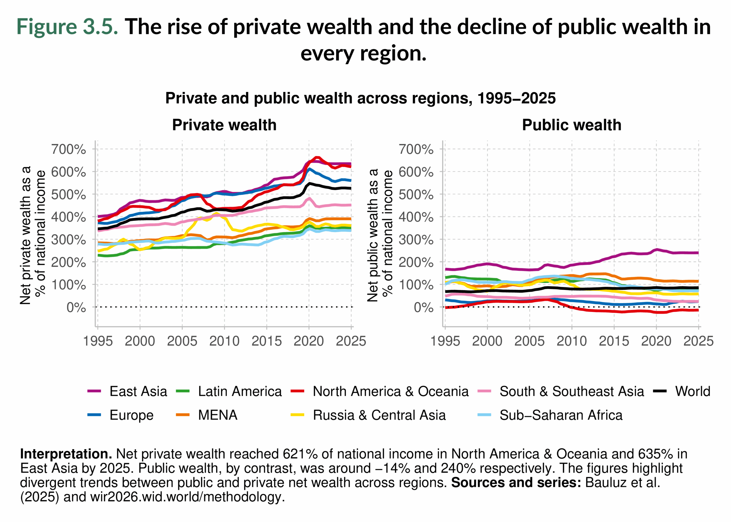
Figure 3.5 shows that East Asia and North America & Oceania now report the highest levels of private wealth, each above 600% of income by 2025 (left-hand-side panel). North America & Oceania’s trajectory, however, has been volatile: strong growth up to 2007, a sharp fall during the global financial crisis, recovery in the 2010s, and a renewed decline after COVID-19. Europe has followed a steadier path, but its private wealth also fell more sharply than the global average after 2020. South & Southeast Asia has steadily built up private wealth, ranking fourth globally, while the Middle East & North Africa overtook Russia & Central Asia during the 2010s. By contrast, Latin America and Sub-Saharan Africa remain far below the world average, reflecting weaker asset accumulation relative to income.
The picture of public wealth is even more striking (right-hand-side panel). East Asia stands out as the only region with substantial and rising public wealth, thanks to sustained public savings and significant state ownership of assets. The Middle East & North Africa, Sub-Saharan Africa, Latin America, and Russia & Central Asia maintain modestly positive levels, but these are well below those in East Asia. Europe and South & Southeast Asia hover close to zero, showing little capacity to build collective wealth. In North America & Oceania, public wealth is negative: governments owe more than they own, with rising public debts offsetting limited state assets.
Overall, the world has become wealthier, but the ownership of this wealth has shifted toward individuals and corporations. Governments, by contrast, have seen their net position weaken, narrowing their fiscal capacity to invest in collective goods or respond to crises. This imbalance between expanding private fortunes and stagnant public reserves is now a defining feature of the global economy. This shift toward private balance sheets raises a second question: how are the flows of income divided between labor and capital? Figure 3.6 answers this.
Figure 3.6 tracks how the income flow is split between labor and capital since 1980. Globally, labor’s share falls from about 61% in 1980 to 53% in 2025, while capital’s share rises from 39% to 47%. This rebalancing toward capital income mirrors the wealth patterns in Figure 3.5 (more wealth overall, and most of it private)1.
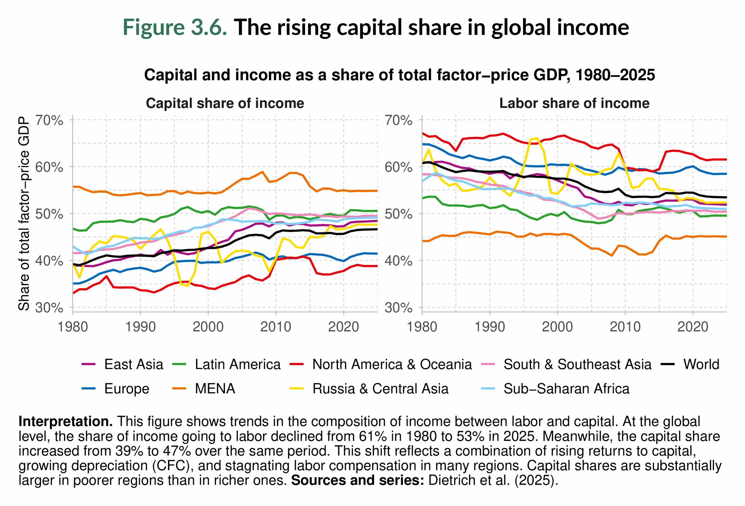
As for regional patterns, North America & Oceania and Europe retain comparatively higher labor shares (and lower capital shares) than other regions. The Middle East & North Africa region shows the lowest labor shares and the highest capital shares, patterns that Dietrich et al. (2025) link to sectoral structure and resource rents. East Asia combines rapid capital-deepening with still-elevated labor shares for much of the period, but its capital share has risen markedly as industrialization and asset expansion progressed. In Latin America, South & Southeast Asia, and Sub-Saharan Africa, labor shares are persistently lower and capital shares higher. These differences are not simply an artifact of sector mix but are likely to reflect higher returns to capital and weaker worker bargaining power in poorer regions (Dietrich et al. (2025)). As the capital share rises, asset owners receive a larger slice of income; higher savings and asset prices among this group compound into faster private-wealth growth (see Bauluz, Novokmet, and Schularick (2022); Piketty and Zucman (2014)).
The world distribution of wealth by region
Figure 3.7 plots the world distribution of per capita wealth in 2025 by stacking regional density curves. The vertical scale is such that the area of each colored wedge corresponds to the region’s share of the world’s adult population. Two features dominate. First, the global distribution is sharply skewed: a long right tail, populated mainly by Europe and North America & Oceania, extends well beyond €250,000 per adult into the million-plus range. Second, most adults worldwide are clustered far to the left of that tail, at low to lower-middle levels of wealth.
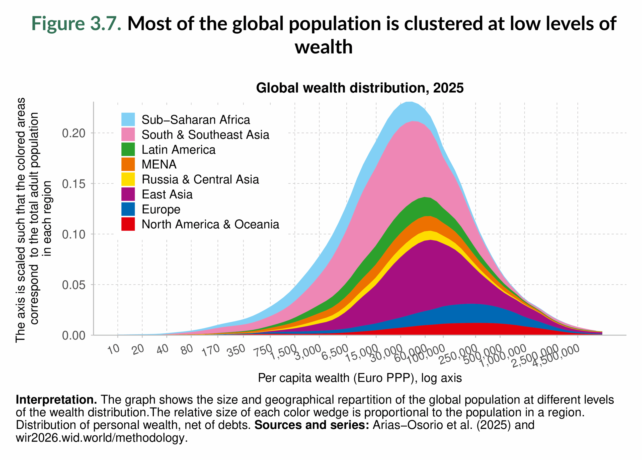
South & Southeast Asia contributes the single largest mass at the center-left of the distribution; its demographic weight largely sets the global peak. East Asia lies to the right of that peak and spreads across a wide band, reflecting decades of asset accumulation that now place a sizable share of adults in the upper-middle range (see Arias-Osorio et al. (2025)). Latin America and the Middle East & North Africa straddle the middle, with a much thinner presence in the global top. Sub-Saharan Africa is concentrated at the very low end, with minimal representation beyond the lower deciles. Europe and North America & Oceania are overrepresented at the top tail and dominate the highest wealth brackets.
Compared with the income distribution shown earlier in Figure 2.5, the contrast is clear: wealth inequality is larger than income inequality. Regions that account for a substantial share of middle-income earners, such as East Asia and parts of South & Southeast Asia, remain underrepresented at the very top of the wealth distribution, while Europe and North America & Oceania are disproportionately present there. Put differently, location still shapes an individual’s chances of reaching the top of the global wealth ladder.
Figure 3.8 disaggregates household net wealth in 2025 into four groups: the bottom 50%, the middle 40%, the next 9%, and the top 1%, for each world region. The picture is stark: in every region, the top 10% owns the majority of wealth, while the bottom half owns almost none. Across regions, the bottom 50% holds between 1% and 5% of total wealth: just 1% in North America & Oceania, Sub-Saharan Africa, and the Middle East & North Africa; 3% in Europe, Latin America, and Russia & Central Asia; and 5% in South & Southeast Asia and East Asia. Put plainly, in every region, half of the population owns no more than 5% of that region’s wealth.
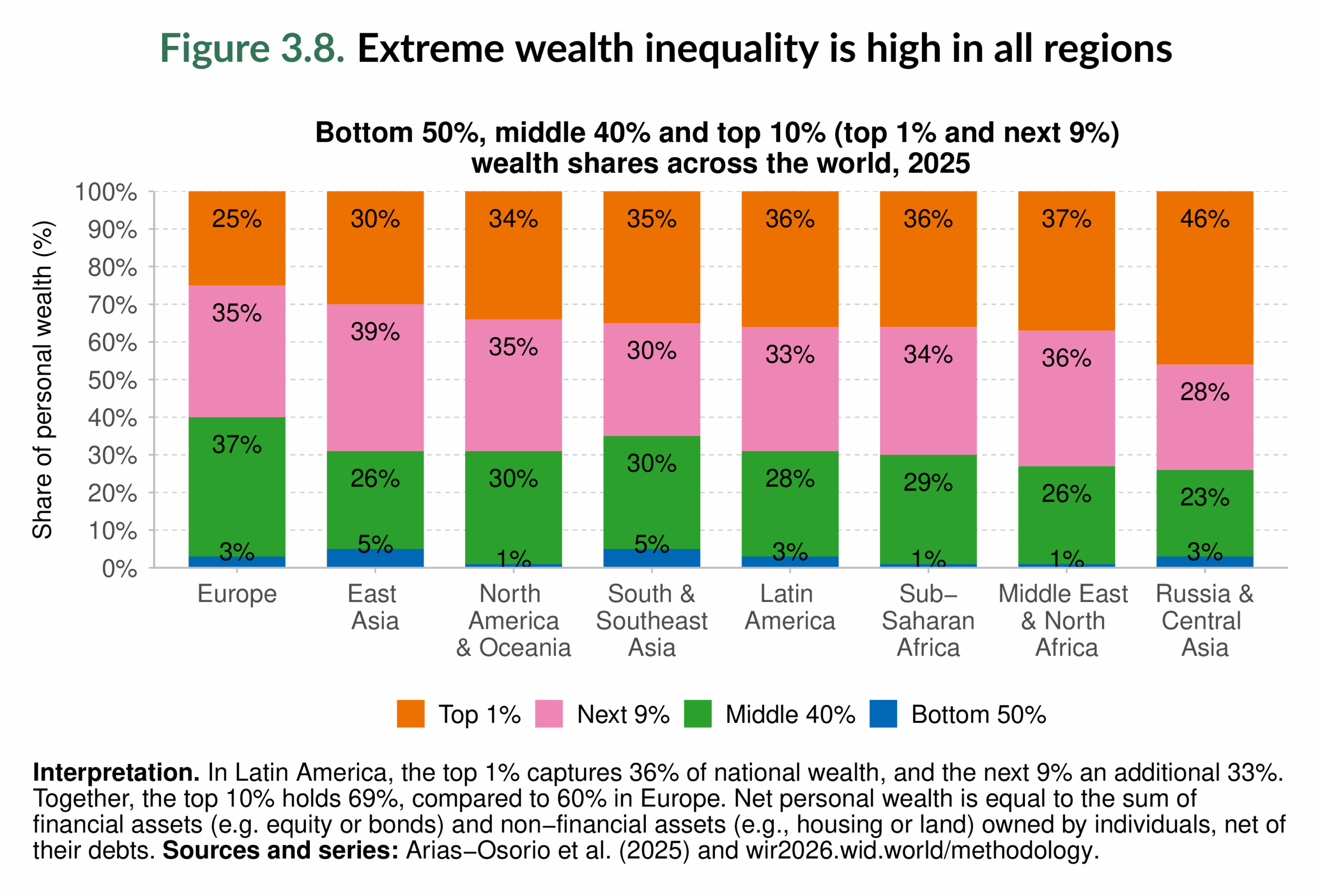
By contrast, the top 10% controls 60–74% of wealth, about 60% in Europe; 65–70% in South & Southeast Asia, East Asia, Latin America, and North America & Oceania; 70% in Sub-Saharan Africa; 73% in the Middle East & North Africa; and 74% in Russia & Central Asia. In every region, one-tenth of the population owns at least 60% of all wealth.
Disaggregating the top 10% shows how concentrated the very top is. The top 1% alone holds a quarter of all wealth in Europe (25%), around a third in North America & Oceania (34%), South & Southeast Asia (35%), Sub-Saharan Africa (36%), Latin America (36%), the Middle East & North Africa (37%), and an excessively high 46% in Russia & Central Asia. In several regions, North America & Oceania, Latin America, the Middle East & North Africa, Sub-Saharan Africa, and Russia & Central Asia, the top 1% own more than the entire bottom 90% combined. One out of every 100 people owns more wealth than ninety individuals in the same group.
Notably, in Europe, the middle 40% holds a sizable 37%, and most of the top-decile share comes from the next 9% (35%) rather than the top 1%. Additionally, East Asia has the largest “next-9%” slice (39%) worldwide, followed by the Middle East & North Africa region (36%) and Europe, North America & Oceania (approximately 35%), consistent with the broad upper-middle profile seen in Figure 3.7.
Compared with the income splits in Chapter 2 (Figure 2.6), wealth is even more concentrated. The top 10% receives 36–57% of regional income but owns 60–74% of regional wealth, and the top 1% earns 12–24% of income but owns 25–46% of wealth. The gap between income and wealth concentration underscores the central finding of this section: within every region, ownership of assets is heavily concentrated at the very top.
Figure 3.9 shows, for each percentile of the global wealth distribution, which regions make up that slice. In 1995, the very top percentiles were overwhelmingly in Europe and North America & Oceania, who dominated the upper decile and especially the top 1%, while some of the Asian population and Sub-Saharan Africa were concentrated in the lower half. By 2025, the map of the upper tail is more multipolar, though not egalitarian. China is the standout mover: its color spreads across the upper-middle percentiles and enters the very top. Its share of the world’s top 1% rose from about one percent in 1995 to roughly one-sixth by 2025. Europe and North America & Oceania still account for a large portion of the global elite, but they now share that space with East Asia. The broad message mirrors Chapter 2’s evidence regarding income: the geography of the elite has diversified, especially toward East Asia, but the structure of the pyramid endures.

Country-by-country patterns of wealth concentration
Having mapped the global distribution of wealth by region (Figure 3.7–Figure 3.9), we now zoom in on how wealth is split within countries. The four maps in Figure 3.10–Figure 3.14 mirror the income analysis in Chapter 2 (Figure 2.9–Figure 2.13), but for net household wealth2. The picture is consistently starker than for income.
Figure 3.10 shows the share of household wealth owned by the bottom 50%. Everywhere in the world, the bottom half owns only a sliver of national wealth, at most around 14% and, in many places, just 1%. Large parts of Latin America, Sub-Saharan Africa, and the Middle East & North Africa fall in the lowest band on the map (below roughly 1–3.8%). The same pattern appears in parts of Central Europe and in the United States. By contrast, several Western European countries, Australia and New Zealand, and large Asian economies such as China and India sit one or two bands higher: their bottom halves still own little, but noticeably more than in the most unequal settings.

The shares of the middle 40% are illustrated in Figure 3.11. The highest bands cluster in Europe and in Oceania, where the middle 40% command a sizable portion of national wealth (around two-fifths, broadly in line with their population weight). The United States and Canada stand out with a much thinner middle share, closer to Latin American and African patterns. In Asia, the middle 40% also capture small shares in China and India.

Figure 3.12 highlights that the top decile owns the majority of wealth in most countries. The darkest colors cover Latin America, southern Africa, the Middle East, Russia, China, and India, as well as the United States, where the top 10% typically control well over 60% of household wealth. Europe and Oceania are lighter on the map: concentration is still high by any standard, but is less than in other parts of the world. Strikingly, nowhere does the top 10% own less than about 45% of total wealth; in some countries, their share approaches 86%, an extraordinary concentration for a group that represents one person in ten.

Focusing on the very top sharpens the contrast (Figure 3.13). The top 1% takes remarkably large shares across Latin America, the Middle East, southern Africa, Russia, India, China, Thailand, and North America. Several European countries and Oceania sit in lower bands, though even there the slice of the top 1% is substantial. In the most extreme cases, the top 1% holds more than 50% of total household wealth in that country; even the lowest values are close to 15%.

The wealth gap (top 10% vs. bottom 50% ratio) in Figure 3.14 is lowest in Western Europe and Oceania. China and India also perform relatively better. The ratio rises sharply across Latin America, the Middle East & North Africa, and southern Africa, and is high in the United States, Indonesia, and Russia.

Figure 3.10–Figure 3.14 confirm that wealth is highly concentrated at the top and even more unequally distributed than income (see Chapter 2). As in Chapter 2, the least unequal patterns are found in the regions of Europe and North America & Oceania, excluding the United States, and, in some cases, Canada. Blanchet and Martínez-Toledano (2023) attribute the higher levels of wealth inequality in the United States relative to Western Europe to the faster growth in the gap between house prices and stock market prices since the 1980s in the latter. The reason is that rising house prices tend to benefit the middle of the wealth distribution, as they own disproportionately more housing in their portfolio than the top or the bottom. The most unequal countries are concentrated in Sub-Saharan Africa, Latin America, and the Middle East & North Africa.
Main takeaways
The chapter shows that every region increased its net national wealth between 1995 and 2025, but the map of wealth has shifted toward Asia. East Asia’s share has risen, Europe’s has lessened, and the long-standing mismatch between population and wealth endures: regions with smaller populations, Europe and North America & Oceania, still command large shares, while populous Sub-Saharan Africa remains marginal.
National wealth is primarily built on domestic capital, but cross-border financial ties create global interdependence . These imbalances mean that part of the capital in debtor regions, most visibly North America & Oceania, is owned by residents of creditor regions, most notably East Asia. We return to this theme in Chapter 5 under the notion of “unequal exchange.”
Global wealth has grown far faster than income since the mid-1990s, rising from just over four to more than six times world income. Almost all of this increase sits in private balance sheets: private wealth climbed from roughly 260 to over 430 percent of world income, while public wealth stagnated at around 80–90 percent and turned negative in some regions. East Asia is the exception, with substantial and rising public wealth. In parallel, the share of income allocated to capital has increased, while labor’s share has declined, thereby reinforcing private asset accumulation.
Over the past few decades, the global elite has diversified. In 1995, the top of the distribution was overwhelmingly European and North American & Oceanian. Today, East Asia has firmly joined their ranks, so that the global top tenth is essentially shared across these three regions. The global “middle-wealth class” is now predominantly Asian, while other regions remain concentrated at the bottom and underrepresented at the top.
Within countries, wealth concentration is even more extreme than income concentration. The bottom half owns little or nothing almost everywhere. The top decile commands the majority in all regions, and the very top one percent captures strikingly large shares. Even in the least unequal settings, wealth gaps remain vast: ownership is tilted decisively toward the top. Chapter 3 delivers a clear message: the world is wealthier, but ownership has shifted even more toward private hands; governments have not kept pace; and wealth is extremely concentrated at the top.
1 Net (after-depreciation) versions in Dietrich et al. (2025) show the same direction but with lower capital shares because consumption of fixed capital is removed.
2 Throughout these maps, wealth refers to household net wealth, financial and non-financial assets minus debts.


