Inequality remains one of the defining economic challenges of our time. Global incomes and wealth levels have risen dramatically, but the distribution of these gains has been profoundly uneven. Today, a very large share of income and wealth is concentrated in the hands of a small share of the population, while billions of people continue to live with limited resources and opportunities.
This chapter analyzes global inequality from several perspectives. We begin by showing current global income and wealth disparities, before highlighting how these divides have deepened at the very top of the distribution. We then turn to a long-run historical view and analyze how global income inequality has evolved over the past two centuries. Finally, we shift the lens to regional comparisons, where the contrast between and within world regions is equally stark. Together, these perspectives provide a foundation for the rest of the report, which explores the current state of global inequality in detail and from multiple angles.
The World is Becoming Richer, but Unequally
For much of human history, population growth was the main driver of economic expansion. Starting in the nineteenth century, however, income per person began to rise much more rapidly than population growth, marking the onset of sustained modern economic growth. Figure 1.1 shows that the world’s population grew from about 1 billion in 1800 to more than 8 billion in 2025, an eightfold increase. Over the same period, average yearly income per person rose from about €900 to nearly €14,000 (in 2025 euros), a sixteenfold increase. Taken together, these two forces translated into an average rise in global output of about 2.2% per year over 225 years.


The growing distance between the population and income curves reflects a profound transformation in living standards. More output per person has meant that humanity, on average, has become far more productive than in the past. At the same time, this rapid growth raises critical questions. Sustaining such levels of output puts increasing pressure on the planet’s resources, and the benefits of growth have been far from evenly shared. In theory, today’s global income would be enough to provide every person with about €1,200 per month (€14,000 per year). In reality, however, these resources are distributed very unequally, with a small minority capturing a disproportionate share of the gains.
Understanding Inequality through Population Groups
Throughout this report, we study inequality within a unit by dividing the unit’s population into broad groups. A unit can typically be the world, a region, or a country. The bottom 50% represents half of the population with the least resources. In the context of global income, this means the poorest half of people worldwide, those earning the least. Above this group is the middle 40%, often described as the "global middle class". These individuals earn enough not to belong to the poorest group, yet they do not form part of the economic elite. At the very top lies the richest 10%, which includes the segment of the global population with the highest incomes.
To better understand how economic resources are concentrated, we also look more closely within the top 10%. This allows us to analyze what share of the population controls the bulk of labor income and asset ownership. Such detail is crucial because inequality is not only about the divide between the poor and the rich, but also about the extreme concentration of resources at the very top. Measuring this concentration with precision is central to the work of the World Inequality Lab and will be a recurring theme throughout the report.
To put these categories into perspective, it is helpful to visualize how many people belong to each group today. In 2025, the world’s population stands at 8.2 billion, and the adult population at 5.6 billion. Figure 1.2 shows that the bottom 50% includes 2.8 billion adults, almost equivalent to the combined adult populations of China, India, the United States, Indonesia, Nigeria, Brazil, and Russia. The middle 40% comprises about 2.2 billion adults, similar to the combined adult populations of China, India, and Mexico. By contrast, the top 10% comprises only 556 million individuals, roughly the size of the combined adult populations of the United States, Pakistan, and Brazil.
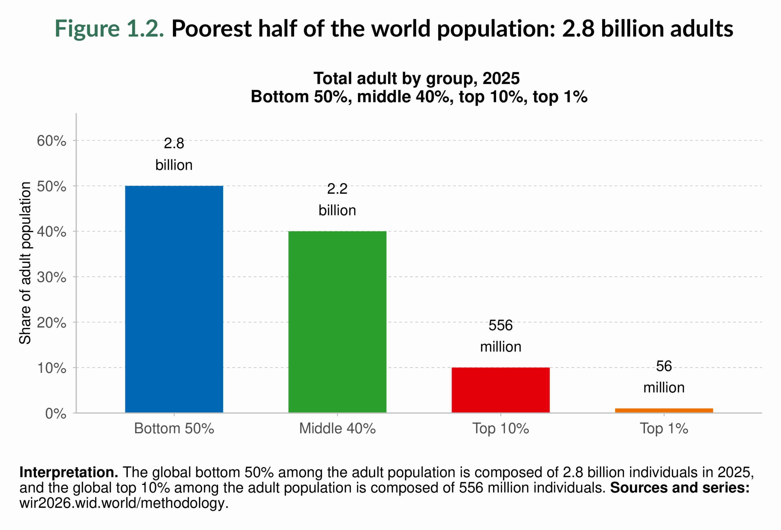
Looking more closely at the very top, the numbers become even smaller but highly significant. The top 1% includes about 56 million adults, similar to the adult population of the United Kingdom. The top 0.1% (5.6 million adults) is similar in size to the total population of Singapore. The top 0.01% amounts to 556,000 adults, about the total population of Genoa in Italy. The top 0.001%, with 56,000 adults, could all fit inside a football stadium. Going further, the top 0.0001% (around 5,600 adults) would fill a concert arena, the top 0.00001% (560 adults) a theater, and the top 0.000001% (56 adults) a single classroom. These comparisons will help illustrate just how concentrated the very top of the distribution is, and they will serve as a reference throughout the report to help readers grasp the magnitude of global inequality.
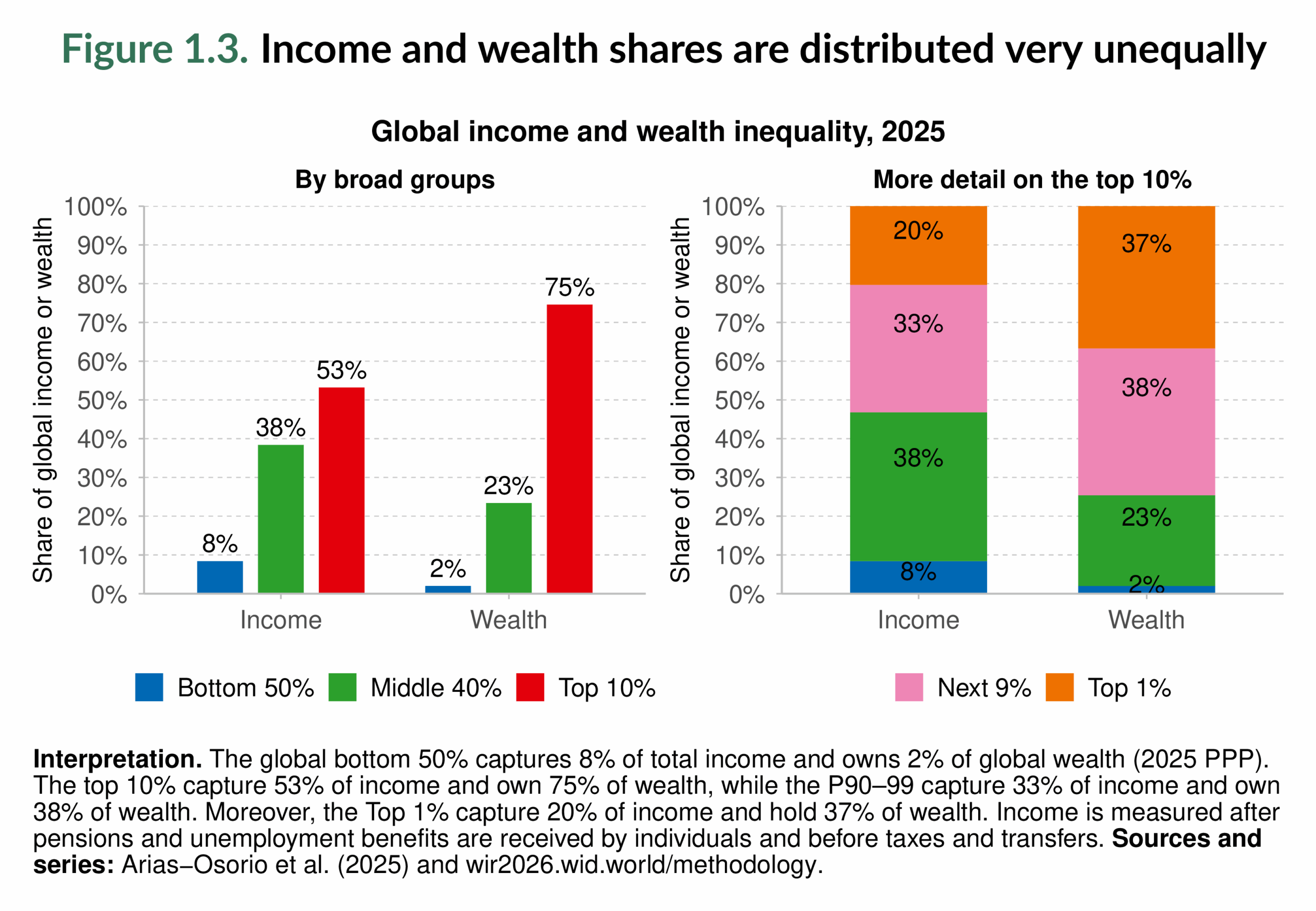
Extreme and Rising Income Inequality
Having these figures in mind, Figure 1.3 illustrates the extent of global inequality. The top 10% (about 560 million adults) receive 53% of global income, while the bottom 50% (roughly 2.8 billion adults) capture only 8%. The contrast becomes even sharper when we zoom into the right-hand panel: the top 1%, a group of just 56 million people, earn 2.5 times more than the entire bottom half of humanity. Put differently, a population comparable to the United Kingdom’s receives more income than a group as large as the combined populations of China, India, the United States, Indonesia, Nigeria, Brazil, and Russia.
If we look beyond these broad groups and zoom in further, the concentration of income becomes even starker. Figure 1.4 makes the concentration of income even more visible. The third column shows that the top 0.1% earn as much as the entire bottom 50%. This means that a group of people no larger than the population of Singapore takes in the same income as half of the world’s population. At the very peak, inequality becomes staggering: the top one-in-a-million (about 5,600 people) earn, on average, one-eighth of what the bottom 50% together receive. In other words, a small concert arena’s worth of individuals has an annual income comparable to that of billions of people.
The fourth column of Figure 1.4 provides another perspective. On average, a person in the bottom 50% earns about €5,100 per year (roughly €425 per month). A person in the top 10% earns about €159,300 annually (€13,275 per month), and a person in the top one-in-a-million earns around €248 million each year (more than €20 million per month). This means that while half of the world’s adults live on less than €500 per month, the top 10% earn 31 times as much, and the very richest earn nearly 50,000 times more.
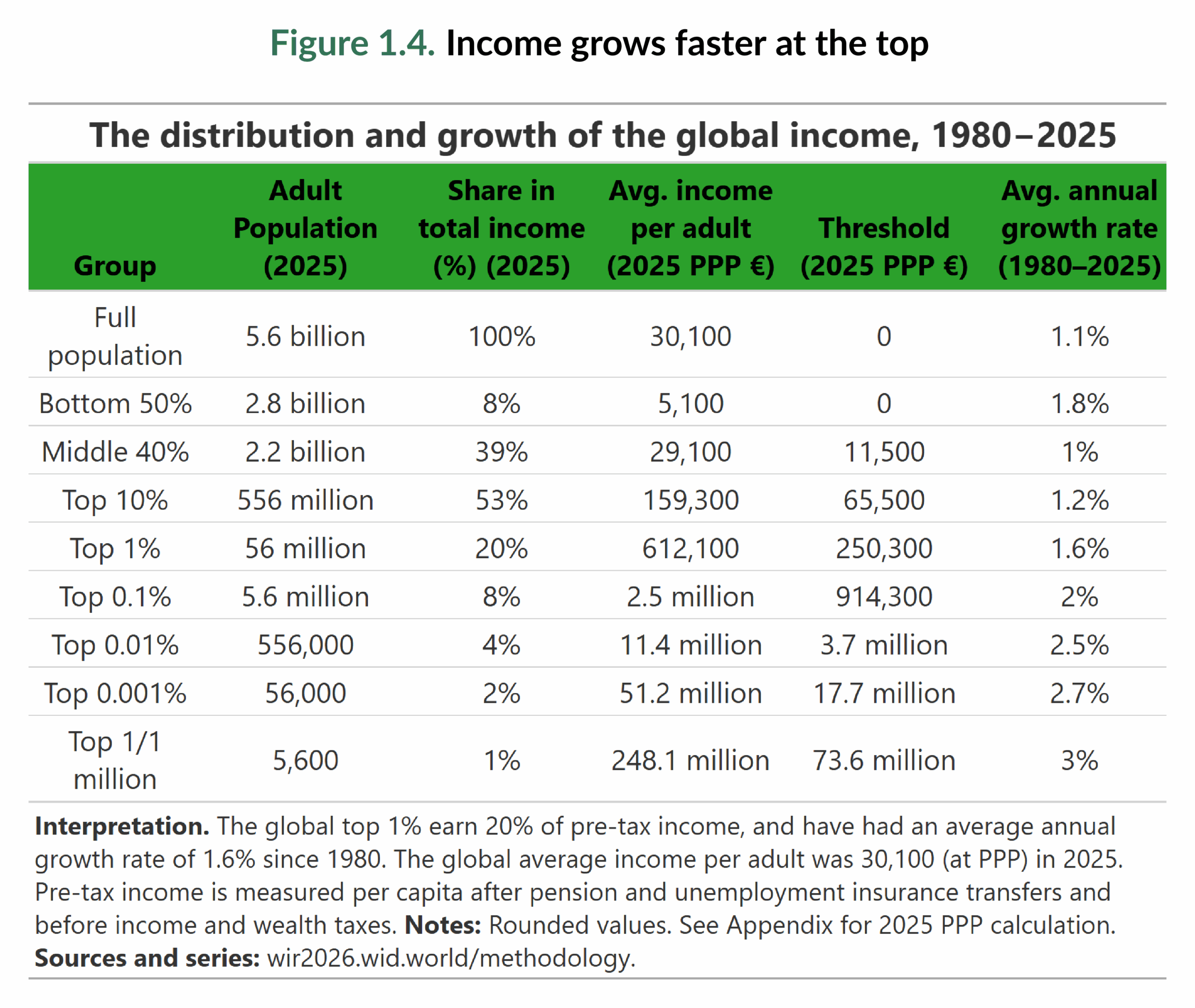
The fifth column of Figure 1.4 shows the thresholds required to enter different income groups. To belong to the top 10%, an individual must earn about €65,500 per year (around €5,460 per month). To reach the top 1%, the threshold rises to about €250,300 annually (€21,860 per month). Unsurprisingly, most of the population earning at these levels is concentrated in Europe, North America, and Oceania. We will return to these regional income disparities in Chapter 2.
Turning to income growth, the last column of Figure 1.4 shows that global income per adult has grown at an average annual rate of 1.1% since 1980. At first glance, the data might suggest a narrowing of inequality: the bottom 50% grew faster (1.8%) than the top 10% (1.2%). But a closer look reveals a different picture. Within the top 10%, the very richest groups have consistently outpaced the average. Every group at or above the top 0.1% has seen growth rates above 1.8% per year, meaning the richest have become richer, even as the bottom half made relative gains. This is one of the strengths of the World Inequality Database: by measuring the entire income distribution, it prevents misleading conclusions that might arise if we stopped at the top 10%.
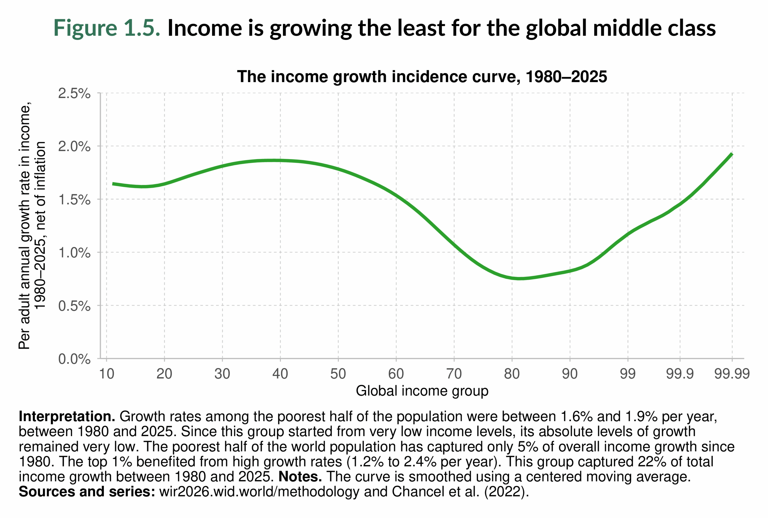
Figure 1.5 complements this analysis by displaying the income growth incidence curve. It shows that while the bottom half of the world has enjoyed relatively robust growth since 1980, the middle 40% experienced stagnation, with some groups growing at less than 1% per year. Meanwhile, growth accelerated again at the very top, with the richest 1% and especially the top 0.1% capturing the fastest gains. The result is a polarized pattern: the poor and the rich have seen their incomes rise, while the global middle class has benefited the least over the past four decades. These uneven growth dynamics explain why today’s distribution of income is so skewed: the gains of the past decades have consolidated mainly at the very top. Such polarization also carries political implications: the relative exclusion of large middle-income groups, the stagnation of many poorer groups in rich countries, and the growing influence of the global plutocracy all raise pressing questions for democratic stability and global governance; we will come back to this point in Chapter 8.
Wealth Inequality is Larger, More Extreme, and Rising Faster
So far, we have seen that inequality is very large when looking at incomes. But income inequality only tells part of the story, since it largely reflects labor earnings. Capital income, which is even more concentrated and closely tied to wealth ownership, adds another layer of inequality.
Figure 1.3 makes this clear: the global top 10% own three-quarters of all wealth, while the bottom 50% hold just 2%. Zooming further in, the concentration becomes staggering. The top 1% alone, roughly the adult population of the United Kingdom, control 37% of global wealth. This is more than eighteen times the wealth of the entire bottom half of the world population, a group as large as the combined adult populations of China, India, the United States, Indonesia, Nigeria, Brazil, and Russia.
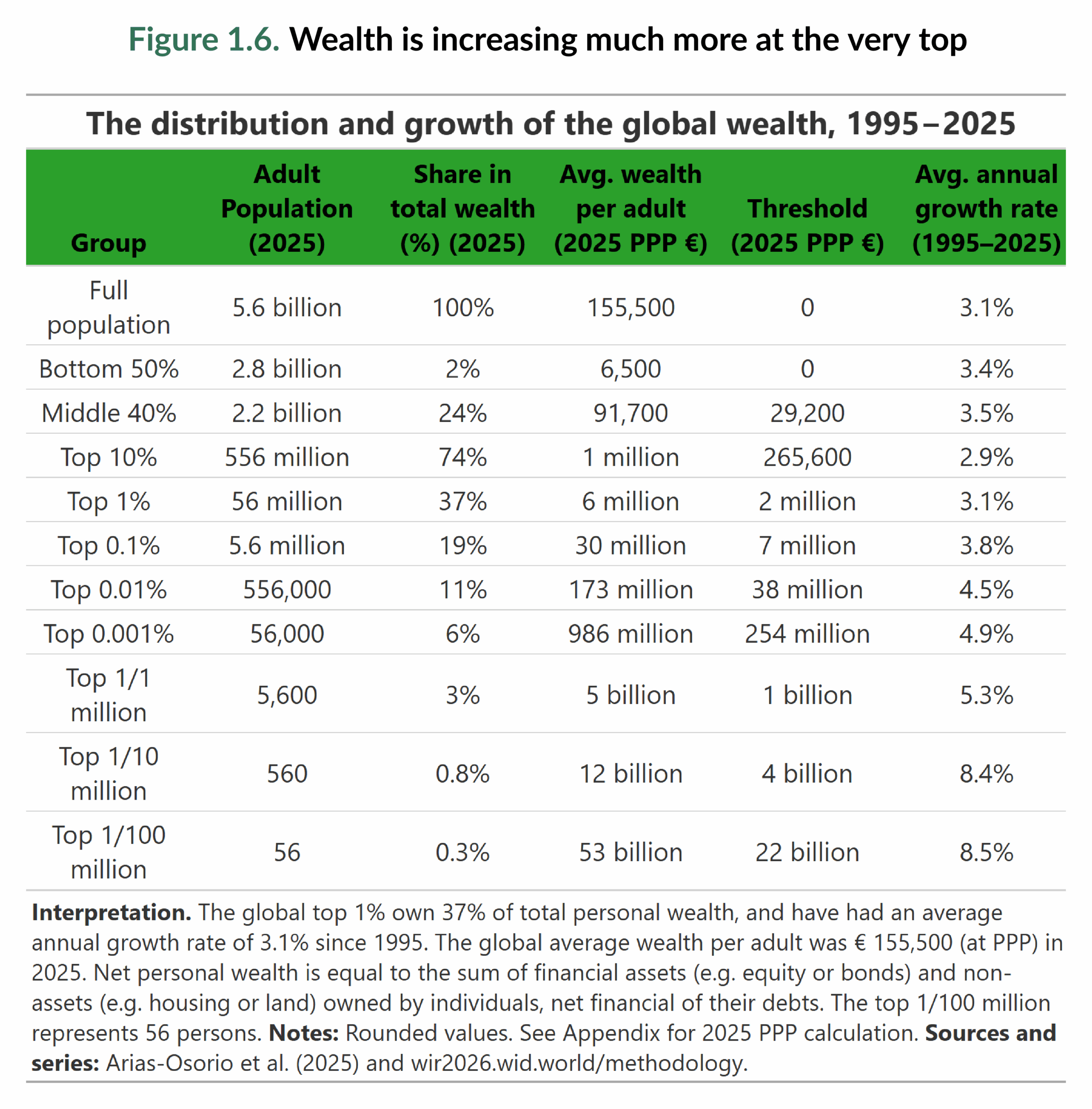
Figure 1.6 sheds light on just how extreme inequality becomes at the very top. The top one-in-a-million (about 5,600 adults, enough to fill a concert arena) collectively hold 3% of global wealth, more than the entire bottom half of the world’s adult population.
The disparities are equally stark when we compare averages. A person in the bottom 50% owns about €6,500, while someone in the top 10% holds around €1 million. But the average wealth of a member of the top 0.001% (about 56,000 adults) is nearly €1 billion, and those in the top one-in-100 million (just 56 adults worldwide) hold on average €53 billion. To put this into perspective, the wealth of a single individual at that level can surpass the individual annual GDP of several Sub-Saharan African countries. These figures underline that today’s inequality is driven not only by the divide between the poor and the rich, but also by the widening gap within the top itself.
Thresholds also illustrate the steep hierarchy. To leave the bottom 50%, an individual needs at least €29,200 in net worth. To enter the top 10%, the bar is €265,600. To join the ranks of the top 0.001%, one must be a centi-millionaire, while entering the top one-in-a-million requires billionaire status. These thresholds highlight the vast distance separating the very top from the rest of the population.
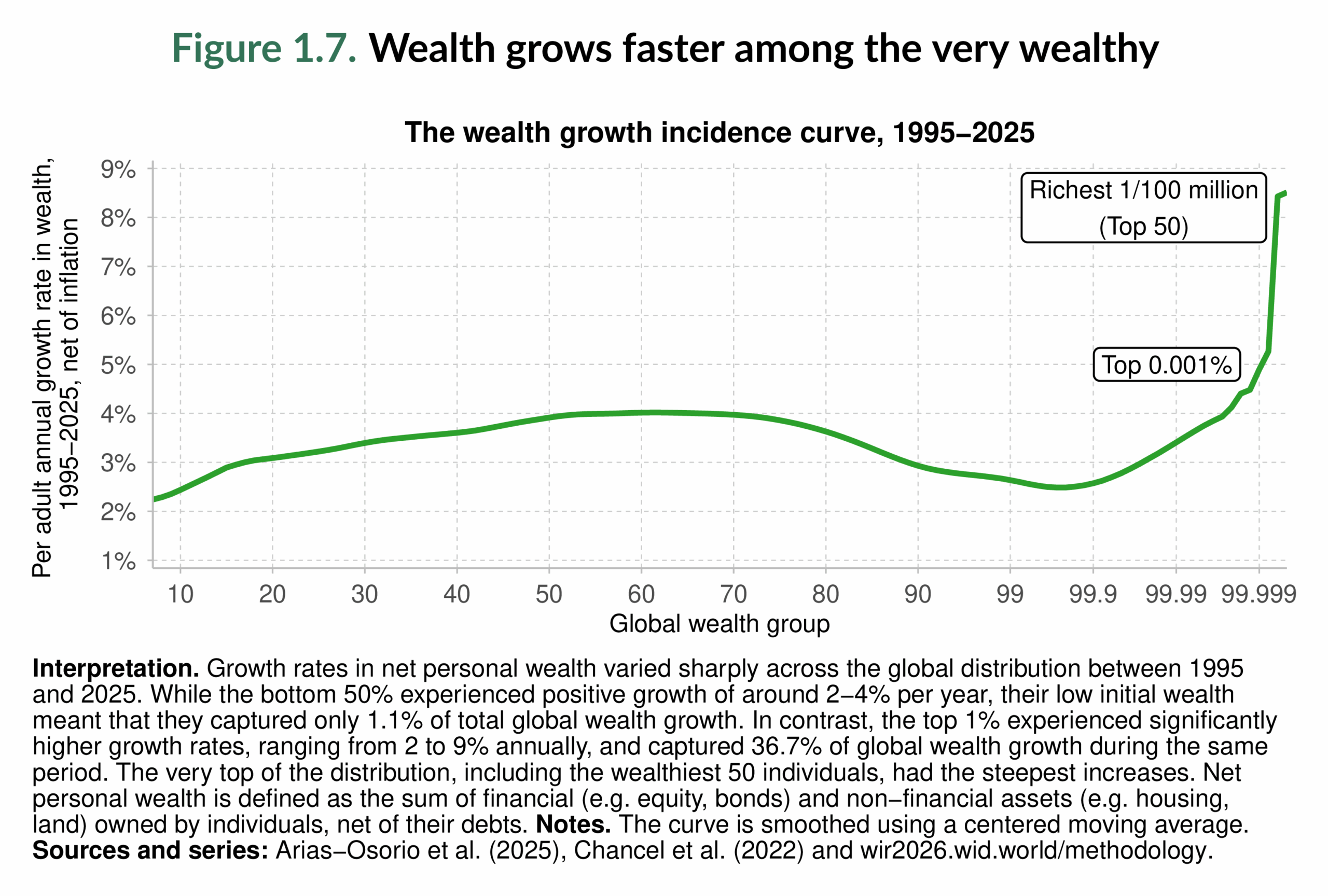
Turning to dynamics, Figures 1.6 and 1.7 show how wealth accumulation has played out over the past three decades. At first glance, one might think inequality is narrowing: the bottom 50% saw their wealth grow at about 3.4% annually, slightly faster than the top 10% (2.9%) or even the top 1% (3.1%). But a closer look shows a very different story. At the very top, billionaires have enjoyed annual increases of 8% per year ; they have multiplied their already vast fortunes, while the absolute gains of the bottom half remain modest.

This accelerating concentration is visible in Figure 1.8, which contrasts the bottom 50% and the top 0.001% trends. Since 1995, the top 0.001%, an ultra-wealthy group, have consistently owned a larger share of global wealth than half of the world’s adult population combined, and their advantage has only grown. By 2025, about 56,000 adults (a group that could fit in a football stadium) own more wealth than 2.8 billion adults combined.
Wealth inequality is not just very large; it is persistent and self-reinforcing. Over the past three decades, the wealthiest individuals have pulled away at an extraordinary pace; this has also affected the distribution of opportunities and power worldwide.
Two Centuries of Persistent and Extreme Income Inequality
While today’s wealth disparities are staggering, they are not an anomaly. The long-run record shows that extreme inequality is not a recent phenomenon but a defining feature of the modern global economy1. Despite two centuries of sustained economic growth, the global distribution of income has also remained profoundly unequal. The evidence shows that income inequality has been both persistent and substantial over the past two centuries. Figure 1.9 illustrates this continuity: since 1820, the top 10% have consistently captured more than half of all global income, while the bottom 50% have never received more than 15%. The middle 40% improved their position somewhat in the twentieth century, particularly from the 1920s to the 1980s, before experiencing a setback up until 2000 and a partial recovery thereafter. Their trajectory mirrors shifts in the income share of the top 10%, while the bottom 50% has remained largely excluded from these gains. Although there has been a slight upward trend for the poorest half in recent decades, their share of income, below 10%, remains lower than it was two centuries ago. So when reductions in inequality did occur, they mostly benefited the middle class, not the bottom half of the world population.

Figure 1.10 zooms in on the extremes of the distribution and reveals the rise of very high-income concentration. In 1820, the bottom 50% received about 14% of global income; by 2025, their share had fallen to just 8%, despite representing about 2.8 billion adults. Meanwhile, the top 1%, around 56 million adults in 2025, have consistently captured close to 20% of global income over the last two centuries. Even more striking is the trajectory of the top 0.1%. Over the past six decades, their income share has converged with that of the bottom 50%. A group now roughly the size of Singapore’s population has persistently earned as much as half of the adult population combined. A broader pattern is also evident: the shares of the top 1% and the top 0.1% peaked around 1910, declined until the 1970s, rose again to a local maximum in 2007, and have followed a slightly upward trajectory since the COVID-19 pandemic.
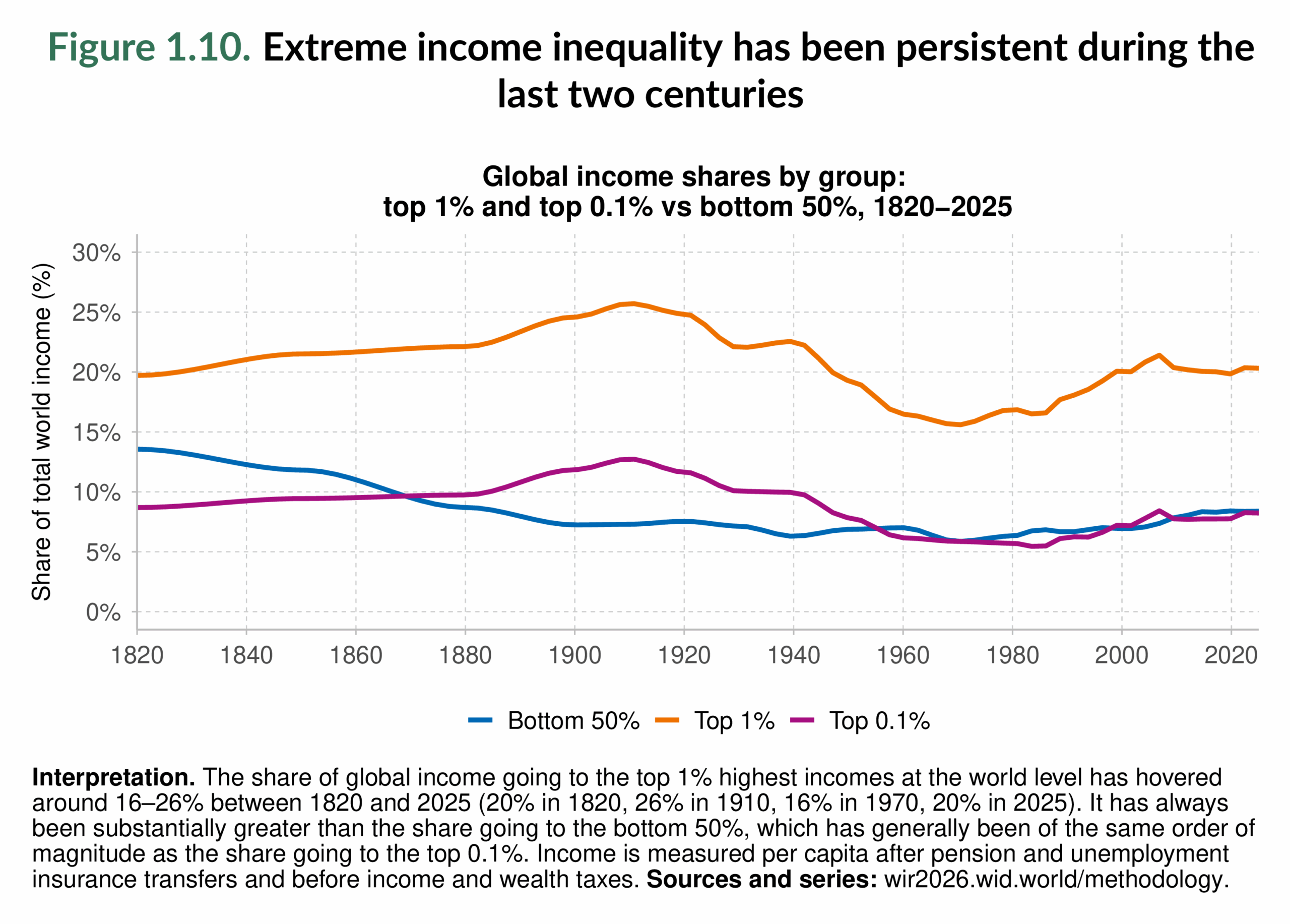
Figure 1.10 puts these trends into a broader perspective by combining the evolution of income growth with income group size. The left-hand panel shows the dramatic increase in global average incomes since 1820, but also underscores how unevenly this growth has been shared. In 1820, the top 10% earned 50% of global income, compared with 14% for the bottom 50%. By 1980, the top 10% still controlled 52%, while the bottom half’s share had fallen to just 6%. Today, in 2025, the top 10% capture 53% of income, while the bottom 50% have only slightly recovered to 8%. Over two centuries, inequality has widened, with the bottom half losing ground relative to both the middle and the top.
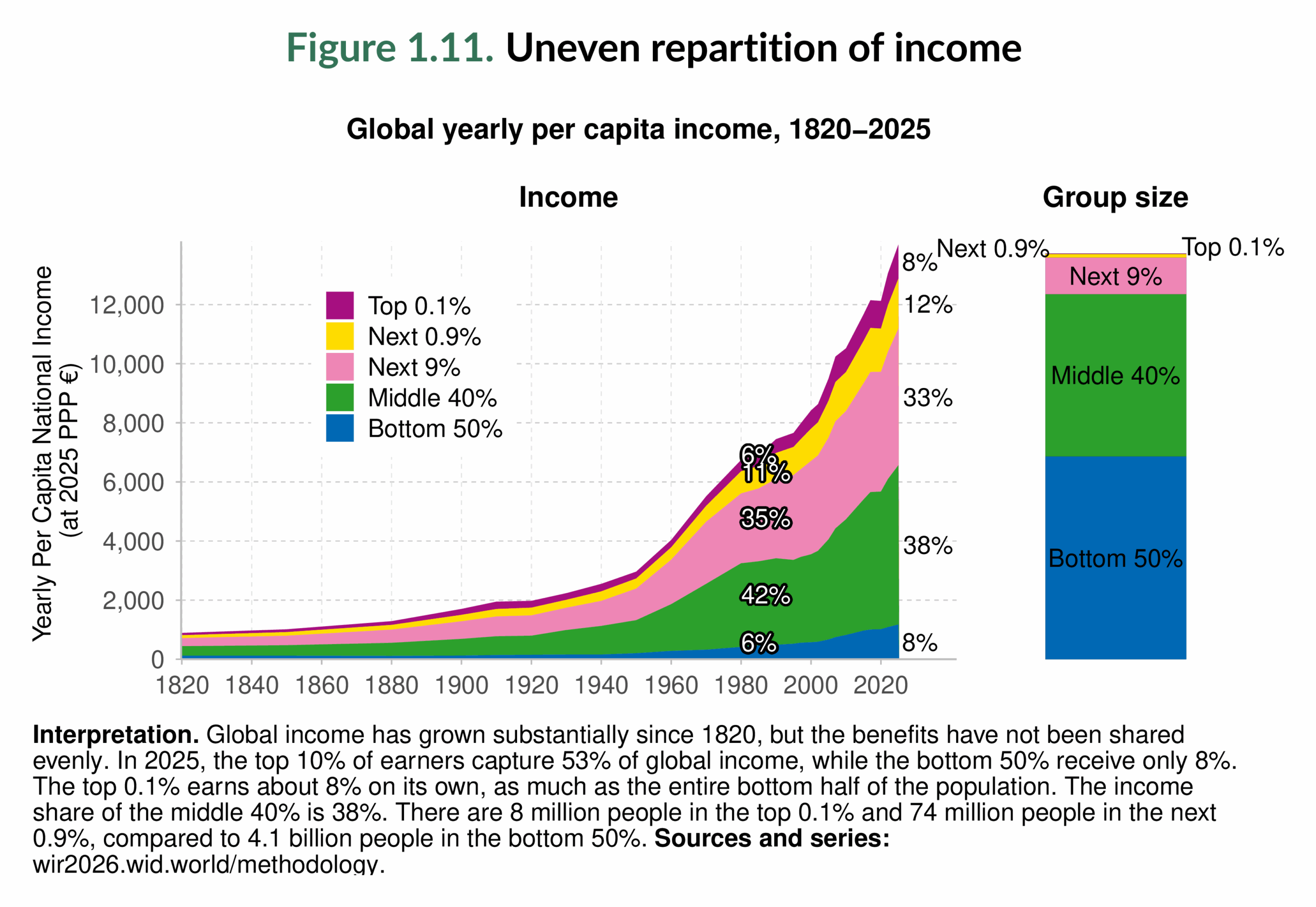
Extreme inequality is also evident at the very top. The global top 0.1% captured 9% of income in 1820, 6% in 1980, and 8% in 2025. While this represents a slight decline over two centuries, it is far smaller than the collapse in the share of the bottom 50%. In other words, the relative gap between the poorest and the very richest has grown wider.
The right-hand panel of Figure 1.11 makes this disconnect especially evident by visually comparing income shares with population shares in 2025. In an equal world, each group’s share of income would match its share of the population. Instead, we see the opposite: the bottom 50%, who make up half of humanity, receive only 8% of global income, while the top 0.1%, too small to be visible in the right-hand-side bar, captures the same amount. This stark contradiction underscores how deeply entrenched extreme income inequality remains, even after two centuries of global economic growth.
While global income has grown enormously over two centuries, its distribution has remained very unequal, with the poorest half persistently excluded from large gains and the very richest consolidating their advantage.
Regional Inequality Is Stark Both Across and Within Regions
The historical view shows that inequality has persistently been a defining trait of the global economy. Yet, this global picture hides deep divides between and within world regions. Regional inequality matters because it is shaped not only by economics, but also by deep-rooted historical, political, and cultural legacies. It also highlights another key dimension: inequality does not just separate rich and poor individuals in the same context; it also entrenches divides between entire parts of the world. Regional comparisons allow us to see both how far apart regions stand from each other (Figure 1.12) and how unequal they are internally (Figure 1.13). The specific country groupings are detailed in Box 1.1.
Figure 1.12 contrasts average income and wealth per adult across world regions in 2025, relative to the world average. The patterns are striking. Wealthier regions are also typically higher-income regions, though there are exceptions. East Asia, for instance, has a higher average wealth level than Russia & Central Asia but a lower average income. At the top of the scale, North America & Oceania and Europe stand well above the global mean. In these regions, and in East Asia, wealth levels exceed income levels relative to the world average. In the rest of the world, however, income levels are relatively higher than wealth levels.

At the bottom of the scale, Sub-Saharan Africa, South & Southeast Asia, and Latin America remain far below the global average on both counts, though Latin America’s average income is somewhat closer to the world mean. The Middle East & North Africa and Russia & Central Asia occupy an intermediate position: their average incomes are closer to East Asia’s and not far from Latin America’s, but their average wealth remains much lower. The contrast is sharp: for instance, in 2025, average wealth in North America & Oceania is 338% of the world average, while in Sub-Saharan Africa it is just 20%. Put differently, the average adult in North America & Oceania owns more than sixteen times the wealth of the average adult in Sub-Saharan Africa.
Turning to Figure 1.13, the focus shifts from differences between regions to disparities within them, using the top 10%/bottom 50% (T10/B50) ratio. This simple but powerful metric asks: on average, how many times more does the top 10% earn (or own) compared to the poorest half? The results reveal enormous divides2. First, wealth gaps everywhere are far larger than income gaps. Even in Europe, the region with the lowest income inequality, the wealth of the top 10% is nearly 200 times that of the bottom 50%. In South & Southeast Asia and East Asia, regions with relatively lower wealth inequality, wealth disparities are still significant and many times greater than income inequality. At the extreme, the Middle East & North Africa and North America & Oceania stand out with the widest wealth divides, over 520 to 1. By contrast, their income ratios are lower than 55 to 1. Other regions, such as Sub-Saharan Africa and Latin America, also combine very high income gaps (over 50 to 1) with staggering wealth gaps (over 260 to 1)..

From Figures 1.12 and 1.13, we can see that inequality is enormous both across regions and within them. Some regions, like North America & Oceania, enjoy higher average income and wealth than the world average, yet still exhibit vast internal disparities. Others, like Sub-Saharan Africa, face the double burden of low average levels and extreme internal divides.
In Chapter 2, we will return to regional income inequalities in greater detail, before turning in Chapter 3 to explore regional wealth inequalities more fully. Together, these perspectives help clarify how inequality is structured not only across the globe, but also within the regions that make it up.
Main takeaways
Over the past two centuries, the world has witnessed an unprecedented rise in average income and output. Yet, global income and wealth shares remain deeply unequal.
The global population is unevenly distributed across the income and wealth hierarchy: 2.8 billion adults belong to the bottom 50%, 2.2 billion to the middle 40%, and only 556 million to the top 10%. Within this top group, sizes shrink from 56 million in the top 1% to just 56 individuals at the very top 1/100 million.
Income inequality is very large. It has persisted and mutated during the last two hundred years and is increasing (see also Chancel and Piketty, 2021). Today, the global top 10% earn more than half of all income while the bottom 50% earn only a tiny fraction, and the richest 0.1% take as much as half of the world’s adult population combined. Looking back two centuries, the top 10% have consistently captured over 50% of global income, while the bottom 50% have remained stuck below 15%.
Wealth inequality is even larger than income inequality and is increasing more rapidly. The top 10% own three-quarters of all assets while the bottom half holds only 2%, and the top 1% alone control 37%, far more than the entire bottom 50%. At the extreme, a few thousand billionaires hold more wealth than billions of people combined, and since the 1990s, centi-millionaires and billionaires have seen their wealth grow far faster than everyone else.
A unique feature of the World Inequality Database (wid.world) is that it measures income and wealth across the entire distribution, from the poorest to the very richest individuals. This makes it possible to uncover extreme concentration at the very top, which would otherwise remain invisible. The chapters that follow will explore these divides in greater depth. Understanding where and how inequality is entrenched is the first step toward designing policies that can address it.
Box 1.1 Regions used in the World Inequality Report 2026
For analytical purposes, the World Inequality Lab divides the world into eight regions: East Asia (EASA), Europe (EURO), Latin America (LATA), theMiddle East & North Africa (MENA), North America & Oceania (NAOC), Russia & Central Asia (RUCA), South & Southeast Asia (SSEA), and Sub-Saharan Africa (SSAF).
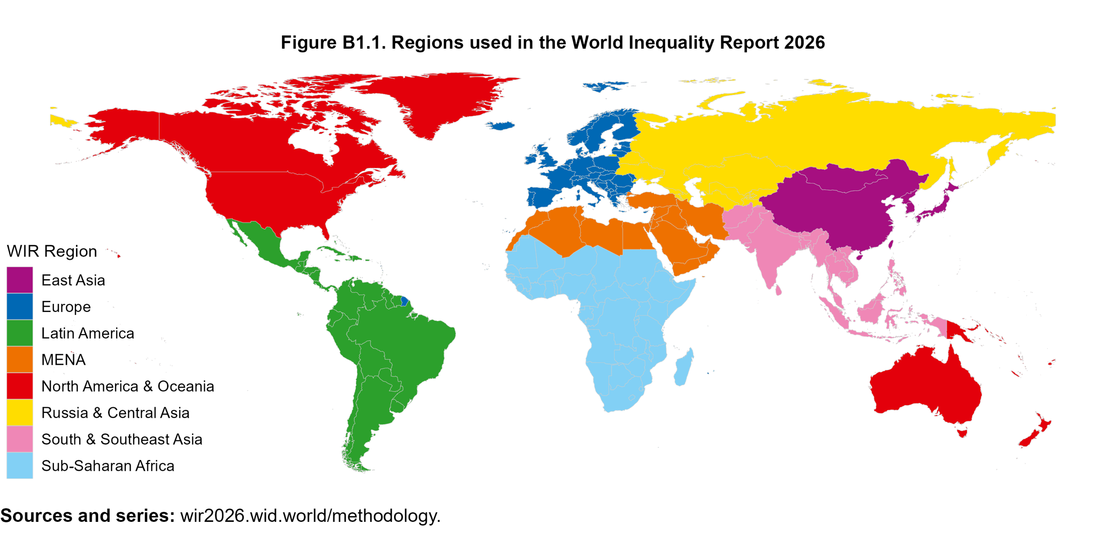
These categories are not fixed: users of the World Inequality Database (wid.world) can regroup countries according to their own criteria.
Box 1.2 The Inequality Transparency Index
High-quality data are essential for informed debates on inequality, yet in many countries information on income and wealth distribution remains scarce or inaccessible. To address this gap, the World Inequality Lab, in partnership with the United Nations Development Program, created the Inequality Transparency Index (ITI). Updated annually alongside wid.world, the ITI measures how transparent countries are in publishing inequality data.
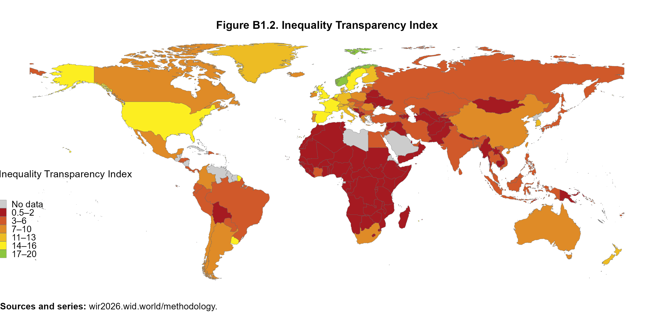
Scores range from 0 to 20. An ideal score reflects the publication of annual distributional accounts of income and wealth, combining household surveys with administrative tax records. No country has yet achieved full transparency.
The ITI evaluates four data sources (income surveys, income tax, wealth surveys, and wealth tax data) across three criteria: quality, frequency, and accessibility. Its purpose is not only to assess the state of inequality statistics but also to encourage governments to publish the data they hold. Without such transparency, public debates risk being guided by conjecture rather than evidence.
1 Furthermore, Alfani (2025) shows that inequality for both income and wealth has tended to grow continuously also in the last seven centuries, not only since the Industrial Revolution.
2 Note: If the top 10% earn 40% of all income and the bottom 50% earn 20%, then the rich make 10 times more on average than the poor (40 ÷ 10 = 4 vs. 20 ÷ 50 = 0.4; 4 ÷ 0.4 = 10).


